Reading time: 7 min read
Using Figma MCP with Cursor to create components in Next.js
Streamline your front-end workflow by transforming Figma designs into production-ready Next.js components directly within the Cursor IDE.
Start typing to search...
The Figma MCP (Model Context Protocol) server fundamentally changes how components are built. When you run it in Cursor (an IDE), the AI agent can inspect your Figma file directly - pulling design specs, extracting tokens, and capturing screenshots without ever leaving the editor. The result is a workflow where a component can go from a Figma frame, to production-ready Next.js code in a single conversation.
In this blog, we'll walk through how that works in a Next.js + TypeScript codebase, and why using MCPs can increase productivity in our workflows.
Before you can use the Figma MCP inside Cursor, you'll need a few things in place:
You can download Cursor here.
Cursor supports MCP servers natively. You configure them in ~/.cursor/mcp.json (global) or .cursor/mcp.json (project-level). MCP servers run as processes that your Cursor agent can call as tools during a conversation.
You can find Cursor's MCP settings by clicking the settings button in the top right corner of the IDE.

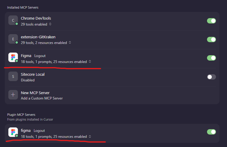
Figma's remote MCP server connects directly to your Figma files via OAuth - no Desktop app required. To install it, type the following in Cursor's agent chat:
/add-plugin figmaThis installs the MCP server configuration, authenticates via OAuth, and adds Agent Skills that guide the AI on how to work with Figma designs. Make sure to toggle it on once the process is complete.
If you prefer to configure it manually, add the following to your ~/.cursor/mcp.json and then authenticate from Cursor Settings:
{
  "mcpServers": {
    "Figma": {
      "url": "https://mcp.figma.com/mcp"
    },
"Chrome DevTools": {
      "command":
 "npx",
      "args": ["chrome-devtools-mcp@latest"]
    }
  }
}
You can click here for a complete guide for setting up Figma remote MCP server.
With the remote server, design context is link-based. You paste a Figma URL directly into your prompt and the server extracts everything it needs automatically. To get the URL for any frame or layer, right-click it in Figma and choose "copy link to selection", or copy the URL from your browser's address bar while the frame is selected:
https://www.figma.com/design/yourfigmaurl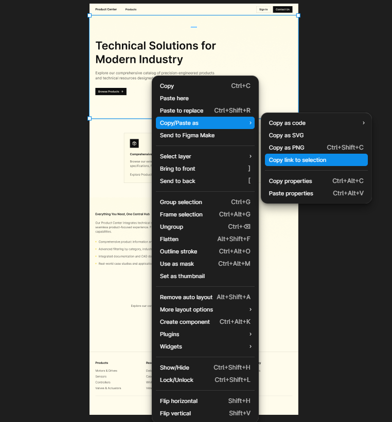
The MCP approach works with any Next.js project. You'll open this project in the Cursor IDE.
In this example, the project is structured with a separation between wrapper components (in src/components/) and presentation components (in src/component-children/). You can structure it however you like:
src/
├── components/[Category]/[ComponentName]/
│   └── [ComponentName].tsx          # Sitecore/framework wrapper
│
└── component-children/[Category]/[ComponentName]/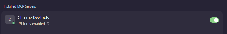
└── [ComponentName].tsx # Presentation + styling logicPairing the Figma MCP with the Chrome DevTools MCP closes the loop: design extraction → code generation → visual validation. The DevTools MCP can navigate pages, capture screenshots, and highlight console errors.
You can install Chrome DevTools via terminal/command line:
npm install -g chrome-devtools-mcp
chrome-devtools-mcp --version
Now, you can switch it on in Cursor Settings:
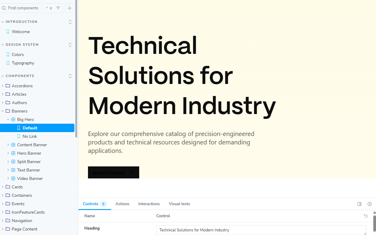
Let's walk through building a BigHero banner component from a Figma design.
The agent can handle everything in one conversation, so you can ask for the component files and its Storybook story in the same prompt. With the remote server, paste your Figma URL directly.
A minimal, but complete prompt looks something like this:
Create a "BigHero" banner component based on the Figma design.
Figma URL: https://www.figma.com/design/yourfigmaurl
The component should include:
- A large heading (h1)
- A description (rich text)
- A CTA link with an arrow icon
Also create a Storybook story at:src/stories/Components/Banners/BigHero.stories.tsx
Include a Default story with realistic mock content, and a NoLinkstory where the optional link field is empty.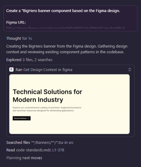
With the design context in hand, the agent creates a types file that maps Figma fields to Sitecore JSS field types (or your CMS/data model of choice):
// src/lib/types/components/Banners/big-hero.ts
import { Field, LinkField } from '@sitecore-jss/sitecore-jss-nextjs';
import { ComponentProps } from 'lib/component-props';
export type BigHeroFields = {
  heading: Field<string>;
  description?: Field<string>;
  link?: LinkField;
};
export type BigHeroProps = ComponentProps & {
  fields: BigHeroFields;
};The agent writes the presentation component, translating Figma's pixel values into Tailwind classes (or whatever CSS library you are using).
// src/component-children/Banners/BigHero/BigHero.tsx
import React from 'react';
import { Text, RichText, Link } from '@sitecore-jss/sitecore-jss-nextjs';
import { BigHeroProps } from 'lib/types/components/Banners/big-hero';
import { cn } from 'lib/helpers/classname';
const ArrowIcon: React.FC = () => (
  <svg
    width="16"
    height="16"
    viewBox="0 0 16 16"
    fill="none"
    xmlns="http://www.w3.org/2000/svg"
    aria-hidden="true"
    className="shrink-0"
  >
    <path
      d="M6 3L11 8L6 13"
      stroke="currentColor"
      strokeWidth="2"
      strokeLinecap="round"
      strokeLinejoin="round"
    />
  <
/svg>
);
const BigHero: React.FC<BigHeroProps> = ({ fields }) => {
  const headingText = fields?.heading?.value || 'Big Hero';
  return (
    <section
      data-component="BigHero"
      className="relative flex w-full items-start bg-gradient-to-b from-[#fefbe7] to-[#fffcec] px-8 pb-0 pt-32"
      role="region"
      aria-label={headingText}
    >
      <div className="flex w-full flex-col items-start">
        <Text
          field={fields?.heading}
          tag="h1"
          className="mb-6 max-w-2xl text-4xl font-semibold leading-tight text-[#0e0e0e]"
        />
        <RichText
          field={fields?.description}
          className={cn('mb-10 max-w-xl text-lg leading-7 text-[#0e0e0e] opacity-70')}
        />
        {fields?.link?.value?.href && (
          <Link
            field={fields.link}
            className="inline-flex h-10 items-center gap-4 bg-[#0e0e0e] px-4 text-sm font-semibold leading-5 text-[#fffcec] transition-colors hover:bg-[#2e2e2e]"
          >
            <span>{fields.link.value.text || 'Learn More'}</span>
            <ArrowIcon />
          </Link>
        )}
      </div>
    </section>
  );
};
export default BigHero;The wrapper component is intentionally minimal. Its only job is to connect the presentation component to the framework (Sitecore JSS in this case - but this pattern could apply to any CMS):
// src/components/Banners/BigHero/BigHero.tsx
import React from 'react';
import { withDatasourceCheck } from '@sitecore-jss/sitecore-jss-nextjs';
import { BigHeroProps } from 'lib/types/components/Banners/big-hero';
import BigHero from 'component-children/Banners/BigHero/BigHero';
const BigHeroDefault = (props: BigHeroProps): JSX.Element => {
  return <BigHero {...props} />;
};
export const Default = withDatasourceCheck()<BigHeroProps>(BigHeroDefault);The agent reviews existing stories in the codebase to learn the project's conventions. Here's what it could produce:
// src/stories/Components/Banners/BigHerostories.tsx
import type { Meta, StoryObj } from '@storybook/nextjs';
import { Default as BigHero } from 'components/Banners/BigHero/BigHero';
import {
  linkFieldArgs,
  stringFieldArgs,
  withDatasourceCheckComponentArgs,
} from 'lib/helpers/storybook';
const meta = {
  title: 'Components/Banners/Big Hero',
  component: BigHero,
} satisfies Meta<typeof BigHero>;
export default meta;
type Story = StoryObj<typeof meta>;
const DefaultArgs = {
  ...withDatasourceCheckComponentArgs,
  fields: {
    heading: stringFieldArgs('Technical Solutions for Modern Industry'),
    description: stringFieldArgs(
      'Explore our comprehensive catalog of precision-engineered products and technical resources designed for demanding applications.'
    ),
    link: linkFieldArgs('/products', 'Browse Products', '_self'),
  },
  params: {},
};
export const Default: Story = {
  args: DefaultArgs,
  render: (args, globals) => {
    const { params } = globals;
    return <BigHero {...args} params={params} />;
  },
};
export const NoLink: Story = {
  args: {
    ...DefaultArgs,
    fields: {
      ...DefaultArgs.fields,
      link: undefined,
    },
  },
  render: (args, globals) => {
    const { params } = globals;
    return <BigHero {...args} params={params} />;
  },
};npm run storybookRun Storybook at http://localhost:6006. Navigate to Components → Banners → Big Hero to see the two new stories.
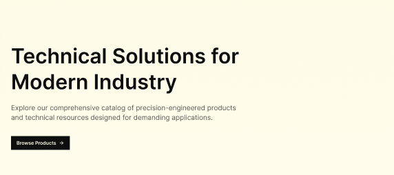
The Figma MCP server did a great job creating the component and its stories - with only minor style tweaks needed (see the button in the screenshot). Compared to the Figma design, it was very close.
There are three main reasons why using the Figma MCP is beneficial.
The traditional handoff process relies on a developer interpreting a static Figma export. The Figma MCP removes that work. The agent reads the actual design data and uses it directly to write code.
Design tokens (colors, type scales, spacing units, etc.) are only useful if developers actually uses them. When the agent extracts tokens from Figma and maps them to tailwind.config.js entries (for example), the code stays consistent with the design system.
Every design-to-component conversation becomes a documented artifact. For example: the prompt, the Figma URLs, the MCP calls, and the generated code, all live in Cursor's conversation history. If a design update comes in months later, you can reference the original conversation and rerun the same workflow with an updated Figma URL.
Figma MCP in Cursor doesn't just speed up component development - it changes what "done" means. A component isn't done when the code compiles; it's done when:
That's the real promise of Figma MCP: not faster component development, but a tighter feedback loop between design and production.