Reading time: 17 min read
How to improve web accessibility using Sitecore features
Practical techniques to boost WCAG compliance and page performance.
Start typing to search...
Web accessibility is the fundamental practice of ensuring that websites, applications, and digital content can be accessed and used by everyone, regardless of ability, device, or circumstance.
Consider the scale of the modern internet: according to a 2025 report by the International Telecommunication Union (ITU), 6 billion people (roughly 74% of the global population) are now online, navigating over 208 million active websites. Yet for the estimated 1.3 billion people worldwide living with a disability, much of this digital landscape remains full of barriers: unlabeled images, vague or broken links, missing captions, and interfaces that simply cannot be operated without a mouse.
Under a UN Resolution, internet access is now recognized as a fundamental human right. Accessibility is no longer just a "nice-to-have" design consideration — it is a legal, ethical, and business imperative. In this blog article, we'll explore the standards that define it, the people it serves, and how developers and content authors can leverage both code and Sitecore's built-in features to build a web that truly works for everyone.
The Web Content Accessibility Guidelines (WCAG) are the globally recognized standards for digital inclusion, developed by the World Wide Web Consortium (W3C) — the international organization that sets the technical rules for the entire internet. These guidelines provide a clear, testable framework for designers and developers to ensure that digital content is truly accessible to all, regardless of physical or cognitive ability.
To help developers and creators meet ethical and legal standards, the World Wide Web Consortium (W3C) established the POUR principles. These four categories ensure that digital content is truly functional for everyone:
Perceivable - information and user interface components must be presentable to users in ways they can perceive. This means providing alt-text for images or captions for videos so that users who cannot see or hear the content still receive the information.
Operable - users must be able to operate the interface. The website shouldn't require interactions that a user cannot perform. For example, ensuring that all functions are available via a keyboard for those who cannot use a mouse.
Understandable - information and the operation of the user interface must be clear. This involves using simple language, maintaining consistent navigation, and providing helpful error messages that explain how to fix a mistake.
Robust - content must be robust enough to be interpreted reliably by a wide variety of "user agents," including assistive technologies like screen readers. As technologies evolve, your website should remain compatible with new tools.
Think of these levels like a staircase: Level A is the first step, Level AA is the landing most sites aim for, and Level AAA is the top of the flight.
Level A: The basic foundation. This level addresses the most critical barriers. Without Level A, a website is nearly impossible for people with disabilities to use.
Level AA: The "industry standard." This is the level required by most global laws. It ensures the site is usable for the vast majority of people.
Level AAA: The gold standard. The highest level of accessibility, often difficult to achieve for an entire site due to strict media requirements.
| Feature | Level A (Basic) | Level AA (Standard) | Level AAA (Enhanced) |
|---|---|---|---|
| Color Contrast | No specific requirement | 4.5:1 ratio | 7:1 ratio |
| Captions | Required for video | Required for live audio | Sign language provided |
| Keyboard | No "keyboard traps" | Standard navigation | No exceptions for any tool |
| Legal Status | Often insufficient | Required by law | Rarely required by law |
Web accessibility isn't just for one group of people; it is about building a digital world that adapts to a wide range of human experiences. To design effectively, we must understand both the diverse disabilities users face and the specialized tools they use to navigate the web.
"The power of the Web is in its universality. Access by everyone regardless of disability is an essential aspect." — Tim Berners-Lee, W3C Director and inventor of the World Wide Web
Disabilities can be permanent (e.g., total blindness), temporary (e.g., a broken arm), or situational (e.g., bright glare on a screen). To build an inclusive site, we must consider four primary categories of impairments:
Visual Impairments - this ranges from total blindness to low vision and color blindness. These users may struggle with small text, low-contrast colors, or purely visual information (like images) that lacks a text description.
Hearing Impairments - users who are d/Deaf or hard of hearing rely on visual alternatives to audio content, such as synchronized captions for video or written transcripts for podcasts.
Motor & Physical Disabilities - this includes users with limited fine motor control, tremors, or paralysis. They often cannot use a traditional mouse and rely entirely on keyboards or specialized switches to navigate.
Cognitive & Learning Disabilities - this covers neurodiversity like Dyslexia, Autism, and ADHD. These users benefit from clear, consistent layouts, simple language, and the ability to stop moving animations that might be distracting.
Just as a person might use a ramp to enter a physical building, digital users rely on Assistive Technology (AT) to navigate the web. AT refers to any piece of equipment or software that helps a person with a disability interact with a computer. To be truly accessible, your code must be compatible with these essential tools:
Screen Readers - software used by people who are blind or have low vision. It "reads" the underlying code of a website (like HTML tags and alt-text) and speaks it aloud.
Screen Magnifiers - tools that enlarge sections of the screen for users with low vision.
Switch Access & Alternative Keyboards - for users with motor disabilities, a "Switch" (often a single large button or a sip-and-puff device) can act as a keyboard.
Speech-to-Text (Voice Control) - users with physical disabilities use their voice to dictate commands and "click" buttons.
Braille Displays - hardware that connects to a computer and converts text into physical Braille pins for users who are both d/Deaf and blind.
| User Disability | Assistive Technology (AT) | Practical WCAG |
|---|---|---|
| Blindness | Screen Readers (e.g., JAWS, NVDA, VoiceOver) | Provide alt-text for images and use semantic HTML (proper nav, main, header tags). |
| Low Vision | Screen Magnifiers or Browser Zoom | Ensure the layout is robust and doesn't "break" or overlap when zoomed to 400%. |
| Color Blindness | High Contrast Modes / Custom Stylesheets | Do not use color alone to convey meaning (e.g., don't just use a red border to show a form error; add an icon or text). |
| Deaf / Hard of Hearing | Captions and Transcripts | Provide Closed Captions (CC) for videos and text transcripts for podcasts or audio clips. |
| Motor Disabilities (e.g., Paralysis, Tremors) | Switch Access, Sip-and-Puff, or Voice Control | Ensure the site is fully operable via keyboard with a visible "Focus Indicator" (the highlight box that shows where you are on the page). |
| Cognitive / Learning (e.g., Dyslexia, ADHD) | Text-to-Speech or Simplified Views | Use simple language, consistent navigation, and provide a way to pause or hide moving animations/carousels. |
Now that we understand who we are building for and what tools they rely on, it's time to translate that knowledge into practice. The following techniques form a developer's essential toolkit for WCAG compliance. Each one addresses a specific guideline and ensures a seamless "handshake" between your website and the assistive technologies described above.
Use HTML tags for their intended purpose to define the core Regions of your page. Utilizing structural tags like header, nav, main, and footer ensures that assistive technologies can immediately identify and navigate to the most important sections of your website.
import { Text, RichText, Link } from '@sitecore-content-sdk/nextjs';
<header>
  {/* Use 'tag' to ensure the proper Semantic level (H1, H2, etc.) */}
  <Text
    tag="h1"
    field={props.fields.pageTitle}
    className="main-heading"
  />
</header>
<nav aria-label="Main Navigation">
  <Link
    field={props.fields.Home}
    aria-label={`Home ${props.fields.title.value}`}
  />
</nav>
<main>
  <article>
    <Text
      tag="h2"
      field={props.fields.pageText}
      className="sub-heading"
    />
    <RichText field={props.fields.bodyContent} />
  </article>
</main>
<footer>
  <Text
    tag="p"
    field={props.fields.footerText}
    className="footer-text"
  />
</footer>Headings (h1 through h6) act as the "table of contents" for screen reader users. Always use them in a nested, logical order. Never skip a level (e.g., jumping from h1 directly to h3) just for visual styling, as this breaks the structural "map" of your page.
import { Text } from '@sitecore-content-sdk/nextjs';
// The 'tag' prop ensures we maintain the correct Heading Hierarchy
// while the 'field' prop pulls the actual content from Sitecore.
<Text tag="h1" field={props.fields.pageTitle} />
<Text tag="h2" field={props.fields.importanceHeading} />
  <Text tag="h3" field={props.fields.legalReqLabel} />
  <Text tag="h3" field={props.fields.humanRightsLabel} />
<Text tag="h2" field={props.fields.implementationHeading} />
<Text tag="h3" field={props.fields.semanticHtmlLabel} />Every meaningful image must include a descriptive alt-text attribute to translate visual content into a format screen readers can communicate. For multimedia, always provide Captions for Video and text transcripts for audio. If an image is purely decorative, use an empty attribute (alt="") so screen readers know to skip it.
import { Image } from '@sitecore-content-sdk/nextjs';
// Sitecore Content SDK automatically maps the 'alt' field from the Media Library
<Image
  field={props.fields.heroImage}
  editable={true}
  className="responsive-img"
/>
// PRO TIP: If the image is decorative, the Content Author should
// leave the Alt field empty in Sitecore, and Content SDK will render alt="".To ensure readability for all users, maintain a minimum contrast ratio of 4.5:1 for standard text (Level AA). This prevents content from "blending" into the background, which is vital for users with low vision, color blindness, or those viewing screens in bright sunlight.
/* GLOBAL CSS: Accessible Color Pairings */
/* High Contrast: Dark Gray on White (Ratio 12.63:1) - PASS */
.theme-light {
  background-color: #FFFFFF;
  color: #333333;
}
/* High Contrast: White on Dark Blue (Ratio 15.2:1) - PASS */
.theme-dark {
  background-color: #002D62;
  color: #FFFFFF;
}
/* AVOID: Light Gray (#CCCCCC) on White or Yellow on White */Tables should only be used to display tabular data, never for page layout. Use the caption tag to provide a visible title explaining the table's purpose. Additionally, define headers using the th tag with the scope attribute so screen readers can associate data cells with their correct headings.
import { Text } from '@sitecore-content-sdk/nextjs';
const GrowthTable = ({ fields }) => (
  <table>
    {/* The Caption provides the "heading" for the table, essential for screen readers */}
    <caption>
      <Text field={fields.tableCaption} />
    </caption>
    <thead>
      <tr>
        {/* 'scope="col"' identifies the header for a column */}
        <th scope="col">
          <Text field={fields.yearHeaderLabel} />
        </th>
        <th scope="col">
          <Text field={fields.usersHeaderLabel} />
        </th>
      </tr>
    </thead>
    <tbody>
      {/* Mapping through a list of Sitecore items to build the rows */}
      {fields.dataRows.map((row, index) => (
        <tr key={index}>
          {/* 'scope="row"' identifies this cell as the header for the horizontal row */}
          <th scope="row">
            <Text field={row.fields.yearValue} />
          </th>
          <td>
            <Text field={row.fields.userCountValue} />
          </td>
        </tr>
      ))}
    </tbody>
  </table>
);When standard HTML isn't enough for complex widgets (like custom tabs or sliders), use ARIA attributes (like aria-label) to provide extra context. The Golden Rule: If you can achieve the result with plain HTML, do it! Use ARIA only when necessary.
import { Text } from '@sitecore-content-sdk/nextjs';
const CloseButton = ({ fields }) => (
  <button
    className="btn-close"
    // We pull the "Close" text from a Sitecore Text field to populate the aria-label for screen readers.
    aria-label={fields?.closeButtonLabel?.value || 'Close'}
  >
    <Text field={fields.menuButtonText} />
  </button>
);A "Skip to Content" link is a hidden anchor that becomes visible when a keyboard user presses Tab for the first time. It allows them to bypass repetitive navigation menus and jump directly to the main content — a Level A requirement under WCAG 2.4.1. Without it, a keyboard user must tab through every single navigation link on every page load.
import { Text } from '@sitecore-content-sdk/nextjs';
const SkipToContent = ({ fields }) => (
  <a
    href="#main-content"
    className="sr-only focus:not-sr-only focus:absolute focus:top-4 focus:left-4 focus:z-50 focus:bg-white focus:px-4 focus:py-2 focus:text-blue-700 focus:outline focus:outline-2 focus:outline-blue-700"
  >
    {fields?.skipLinkText?.value || 'Skip to main content'}
  </a>
);
// Then in your Layout component:
const Layout = ({ fields, children }) => (
  <>
    <SkipToContent fields={fields} />
    <header>
      <nav aria-label="Main Navigation">
        {/* Navigation links */}
      </nav>
    </header>
    <main id="main-content">
      {children}
    </main>
  </>
);Ensure all interactive elements have a visible Focus State (like an outline) so keyboard-only users can see their location on the page. Use Descriptive Links (avoid "Click Here") so the destination is clear. Finally, never rely on a Hover state alone to reveal critical information, as this excludes keyboard and mobile users.
/* GLOBAL CSS: Ensure focus is never hidden */
/* This works automatically for Content SDK 'Link' and 'Image' components */
a:focus,
button:focus,
input:focus {
  outline: 3px solid #0056b3; /* High contrast blue */
  outline-offset: 2px;        /* Adds space between the element and the outline */
}
/* Optional: Only show focus for keyboard users, not mouse clicks */
:focus-visible {
  outline: 3px solid #0056b3;
                                                                                                                                                }
import { Link } from '@sitecore-content-sdk/nextjs';
const ReportDownload = ({ fields }) => (
/* The 'Link' helper renders the 'text' field from Sitecore as the link content.
It also maps the 'title' attribute, which provides extra context to screen readers. */
<Link
field={fields.downloadReportLink}
className="btn-download"
/* Example output: <a href="/-/media/report.pdf">Download the 2026 ITU Report (PDF)</a> */
/>
);While developers lay the technical foundation, content authors are the ones who maintain accessibility day-to-day. Sitecore provides built-in features to ensure your content remains compliant with WCAG standards.
Accessibility for images starts in the Media Library. By setting these properties once, you ensure the image is accessible everywhere it is used on the site.
Alt-Text Properties - under Media Library, navigate to your desired image and locate the Alt field under the Image tab. This should contain a concise description of the image.
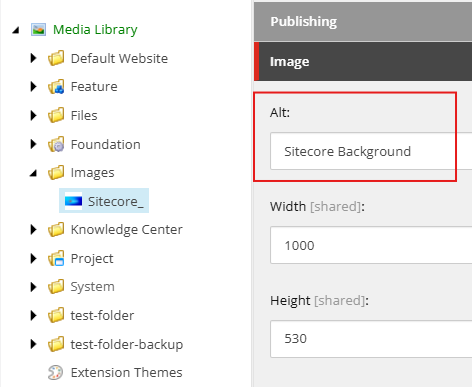
Decorative Images - if an image is purely for design, leave the Alt field empty. Sitecore Content SDK will automatically render alt="", telling screen readers to skip it.
Whether you are using the Content Editor or Experience Editor, Sitecore's link tools allow you to provide the necessary "Accessible Name" for every destination.
Internal & External Links - when using Insert Link or Insert External Link, always fill out the Description field. This text becomes the clickable link, helping you avoid vague "Click Here" labels.
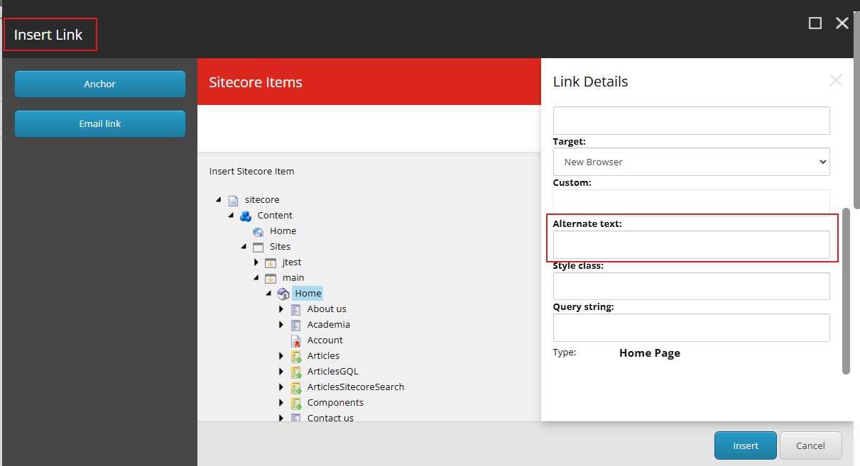
Media Links - when linking to a PDF or document, include the file type in the description (e.g., "Annual Report 2026 [PDF]") so users know what to expect before the download begins.
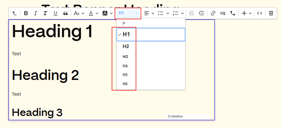
The Rich Text Editor is the most powerful tool for an author, but it requires discipline to stay accessible.
Semantic Headings - use the Paragraph Format dropdown to select H1, H2, H3, etc.
Pro-Tip: Do not choose a heading based on its font size; choose it based on its place in the logical outline of your page.
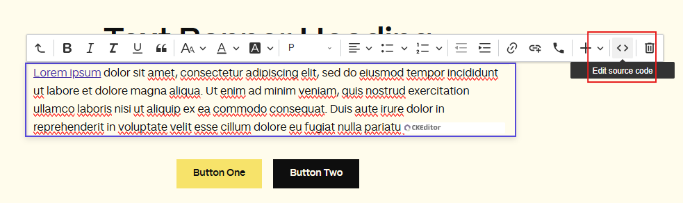
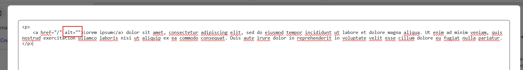
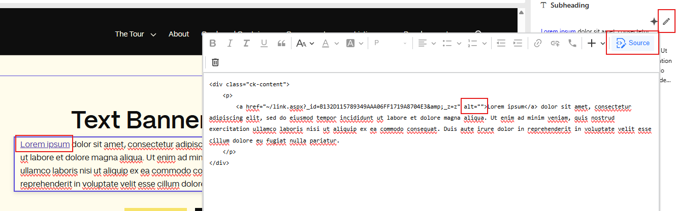
Source Code Editing - for advanced users, clicking the Edit source code icon (<>) or the Pen icon on the right side of screen allows you to manually verify that your links and images have the correct attributes, such as aria-label, title, or alt=""
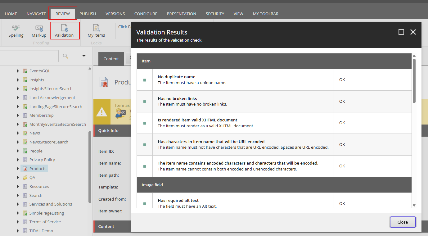
Before you publish, use Sitecore's "hidden" superpower: the Accessibility Validation tool.
In the Content Editor, navigate to the Review tab > Validation. Sitecore will scan your content for broken alt-text, missing headers, and table errors, providing a report of what needs to be fixed to meet WCAG compliance.
While traditional methods — such as manual code inspection (DOM Audits), automated scans like Lighthouse, keyboard-only navigation, and screen reader testing using Narrator (Windows) or VoiceOver (macOS) — remain essential for deep testing, modern browser extensions provide a more efficient and automated way to identify compliance gaps in real-time.
Integrating these tools into your development and authoring workflow allows you to catch technical errors (like broken ARIA labels or low contrast) before they reach the user. Here are the industry-leading extensions to help you audit your Sitecore site:
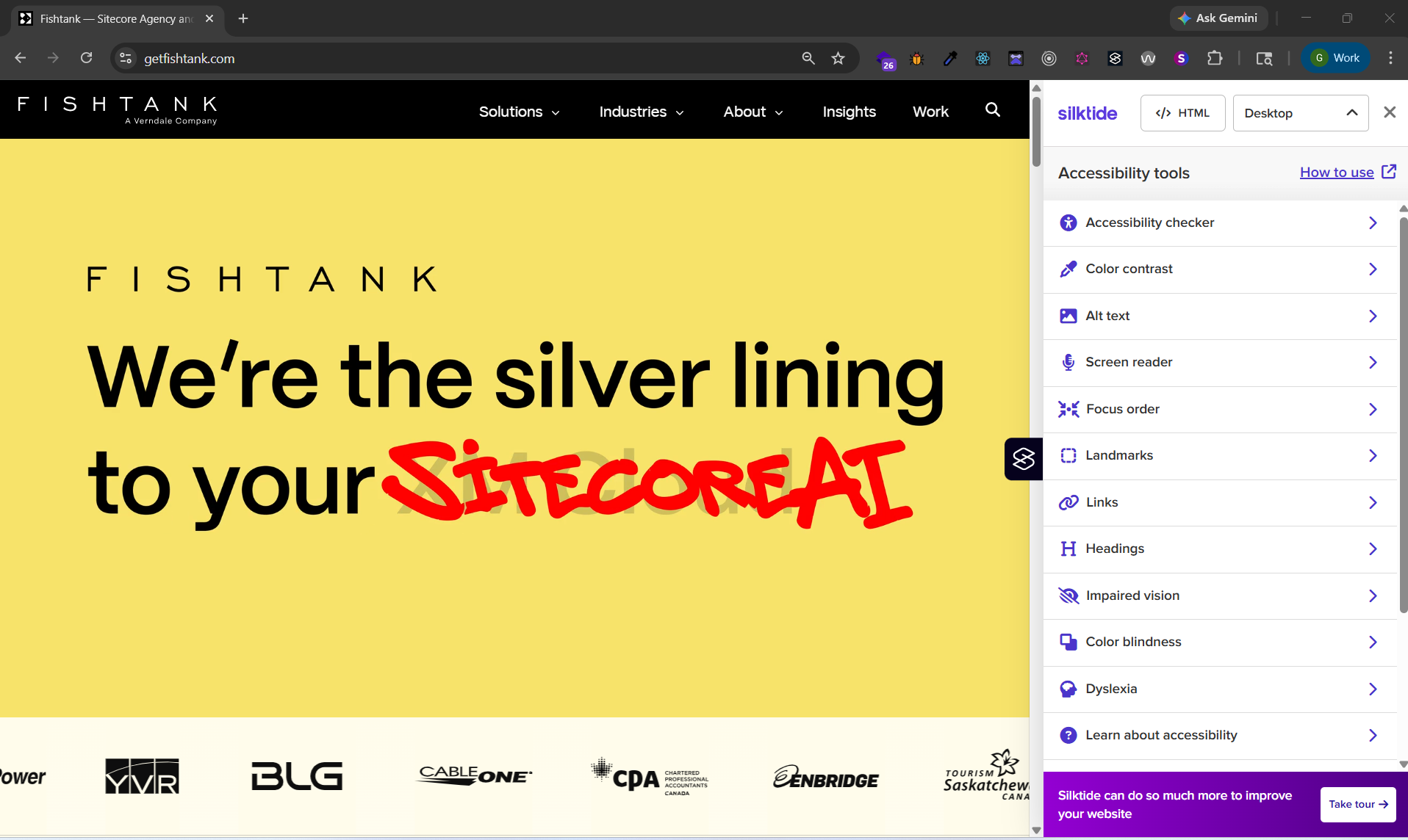
Silktide Accessibility Checker - provides a comprehensive score and simulates various disabilities (like impaired vision, color blindness or dyslexia) to help you experience your site as your users do.
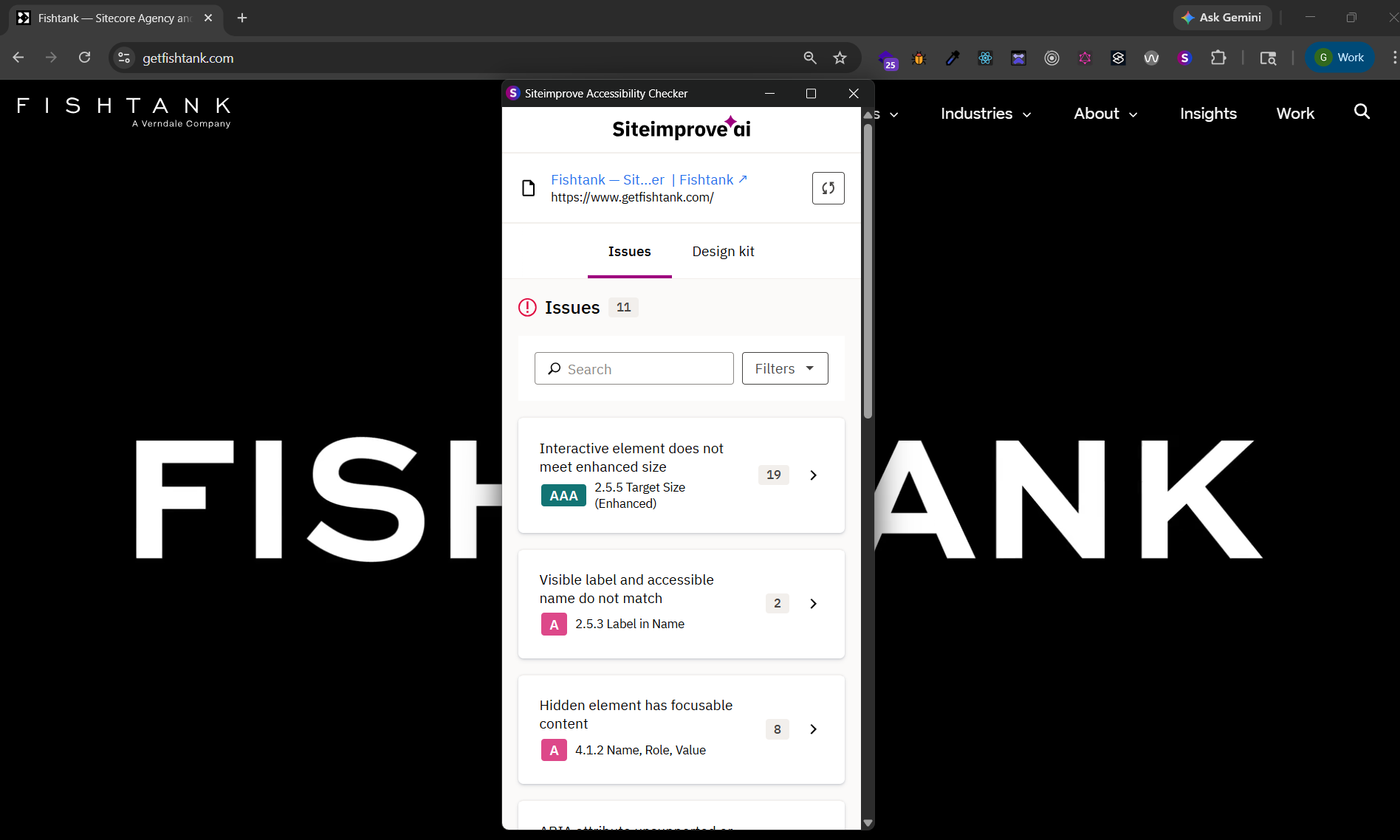
Siteimprove Accessibility Checker - a powerful tool that maps directly to WCAG 2.2 standards, highlighting exactly which elements fail compliance and providing clear instructions on how to fix them.
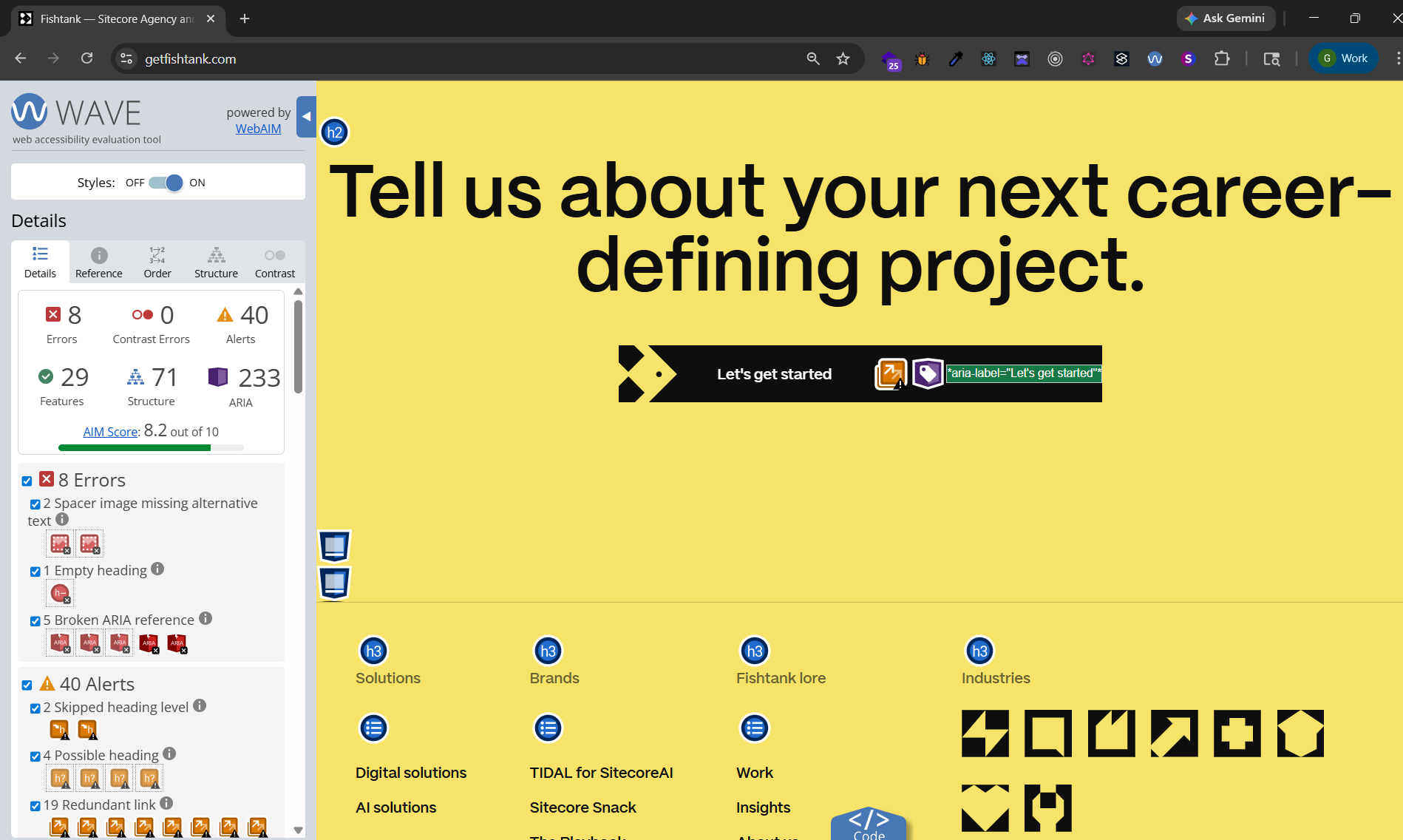
WAVE Web Accessibility Evaluation Tool - created by WebAIM, this tool provides a visual overlay directly on the page, making it easy to spot missing alt-text, skipped heading levels, and structural errors at a glance.
Accessibility isn't about designing for a "special" group; it's about designing for human diversity. It is an ongoing commitment into every stage of the digital lifecycle from design and development to content authoring and quality assurance. By grounding our work in WCAG standards and POUR principles, we ensure that the human experience remains at the heart of every technical decision.
For those working with Sitecore, the path to compliance is uniquely supported. When developers establish a foundation of semantic HTML and ARIA attributes, Sitecore's built-in tools (like the Media Library and Accessibility Validator) empower content authors to maintain those high standards daily. By reinforcing this workflow with modern browser extensions like Silktide, Siteimprove or WAVE, teams create a proactive feedback loop that catches issues before they reach the user.
Ultimately, accessibility is a shared responsibility. When developers, authors, and testers collaborate, the result is more than a compliant website. The result is a digital experience that respects and empowers every person who visits it. In a world where digital access is a fundamental right, building for everyone is the only way forward.