Reading time: 8 min read
Rendering parameters vs. Headless variants: choosing the right Sitecore extension
How to architect scalable Sitecore components by choosing the right extension method for your team
Start typing to search...
Headless Sitecore (JSS, Content SDK) gives you two main levers for the same registered component: rendering parameters (key/value data that travels with the placement) and headless variants (separate React entry points mapped to the same component definition in Sitecore). Used well, they keep experiences consistent and authoring simple. Used carelessly, they create duplicate logic, confused authors, and variant explosion.
This post walks through both concepts, compares them, and ends with practices we apply in the Next.js starter so implementation stays maintainable.
Rendering parameters are name/value pairs stored on the rendering instance (per component placement on a page or in a shared presentation). They are not the datasource's fields; they configure how that instance behaves — layout, CSS hooks, feature toggles, or IDs used by the front end.
In the Content SDK, they surface on every component as params (and the full rendering object often carries a merged view of the same data). The TypeScript contract for that is ComponentProps in src/lib/component-props/index.ts (rendering plus params with helpers like styles, RenderingIdentifier, and EnabledPlaceholders from the platform).
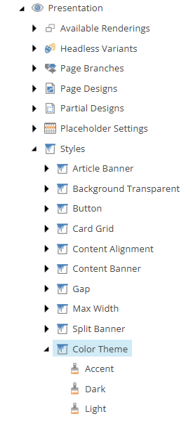
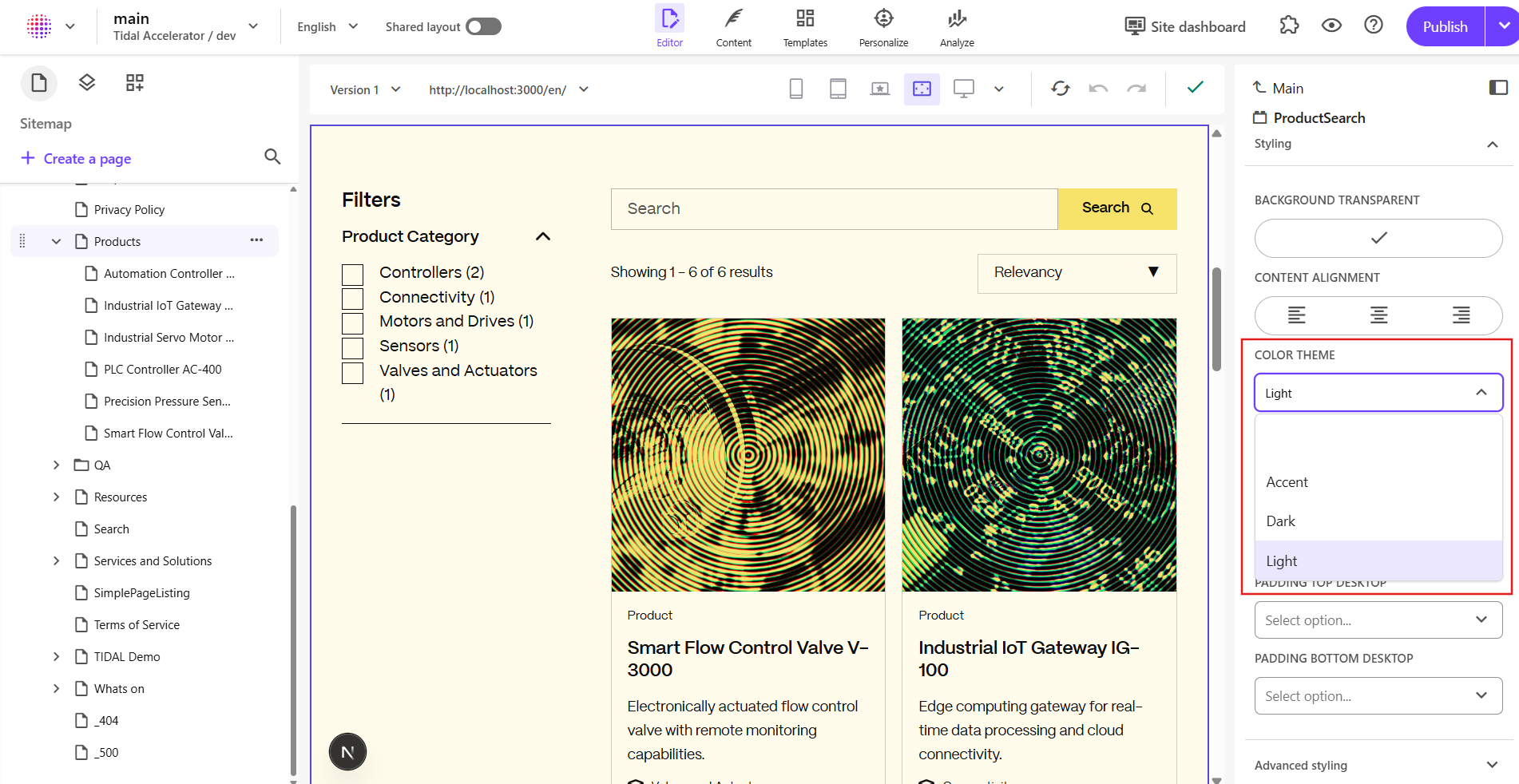
Example from the codebase — color theme via Styles: In Page Builder, the Color Theme (or similar) control often shows author-facing labels such as Light, Dark, and Accent — what you see in the UI. Those labels usually come from each style item's Display name in Sitecore, while the item's Value field still stores the token the head app must parse, e.g. theme:primary, theme:secondary, and theme:tertiary (this starter's Presentation → Styles → Color Theme items are wired that way in source control). So "Light" in Page Builder does not mean the string sent to React is the literal token light; it means the author picked the style whose Value contributes theme:primary into the Styles parameter.
Content Editor
Page Builder
| Typical Page Builder label (example) | Token in params.Styles (style item Value) | effectiveTheme in code (useFrame) |
|---|---|---|
| Light (e.g. item named Primary) | theme:primary | primary |
| Dark (e.g. item named Secondary) | theme:secondary | secondary |
| Accent (e.g. item named Tertiary) | theme:tertiary | tertiary |
Display names in your site may differ; the middle column is the contract the Next.js app parses. Child components (for example Button) branch on effectiveTheme and use comments in code that describe light vs dark surfaces in UX terms, while the implementation still uses the primary / secondary / tertiary constants below.
In the code
Frame passes params into FrameProvider:
// src/component-children/Shared/Frame/Frame.tsx
const Frame = (props: FrameProps): JSX.Element => {
  return (
    <FrameProvider params={props.params} componentName={props.componentName}>
      <FrameRendering {...props} />
    </FrameProvider>
  );
};
FrameProvider reads params.Styles and resolves effectiveTheme:
// src/lib/hooks/useFrame.tsx
export const FrameProvider: React.FC<FrameProps> = ({ params, componentName, children }) => {
  const parentContext = useContext(FrameContext);
  const currentProps = parseRenderingProps(params?.Styles, componentName);
  const contextValue: FrameContextValue = {
    ...currentProps,
    parentTheme: parentContext.theme || parentContext.parentTheme,
    effectiveTheme: (currentProps.theme ||
      parentContext.theme ||
      parentContext.parentTheme ||
      PRIMARY_THEME) as ThemeType,
  };
  return <FrameContext.Provider value={contextValue}>{children}</FrameContext.Provider>;
};
Parsing the theme: token from the Styles string:
// src/lib/helpers/rendering-props.ts
const properties = input.split(' ');
properties.forEach((prop) => {
  const [key, value] = prop.split(':');
  if (key === 'theme') {
    const mappedTheme = mapping[key]?.[value];
    if (!mappedTheme) {
      console.warn(
        `[Sitecore] Invalid theme value "${value}" provided. Falling back to "${PRIMARY_THEME}".`
      );
    }
    result[key] = (mappedTheme || PRIMARY_THEME) as ThemeType;
    return;
  }
  // Allowed `theme` values (from `Styles`, e.g. `theme:primary` in Sitecore **Color Theme** style items):
});
Allowed theme values (accent / surface bands):
// src/lib/helpers/rendering-props-mapping.ts
theme: {
  primary: PRIMARY_THEME,
  secondary: SECONDARY_THEME,
  tertiary: TERTIARY_THEME,
},
Downstream: Button uses useFrame().effectiveTheme for contrast (comments refer to light vs dark sections; the resolved buttonColor values are the design tokens secondary / tertiary / primary):
// src/component-children/Shared/Button/Button.tsx (excerpt)
const { effectiveTheme } = useFrame();
const buttonColor = color
  ? color
  : effectiveTheme === PRIMARY_THEME || effectiveTheme === TERTIARY_THEME
    ? 'secondary' // Parent uses light theme → button defaults to dark
    : effectiveTheme === SECONDARY_THEME
      ? 'tertiary' // Parent uses dark theme → button defaults to yellow
      : 'primary';
When parameters shine: per-instance options that do not belong in the datasource, keys driven by presentation (like the Styles string and theme:… tokens), and anything you want authors to set per placement without a new headless variant.
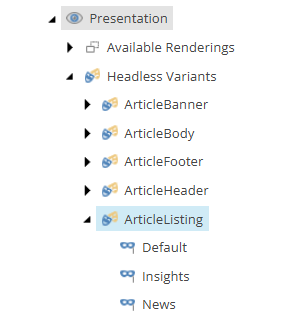
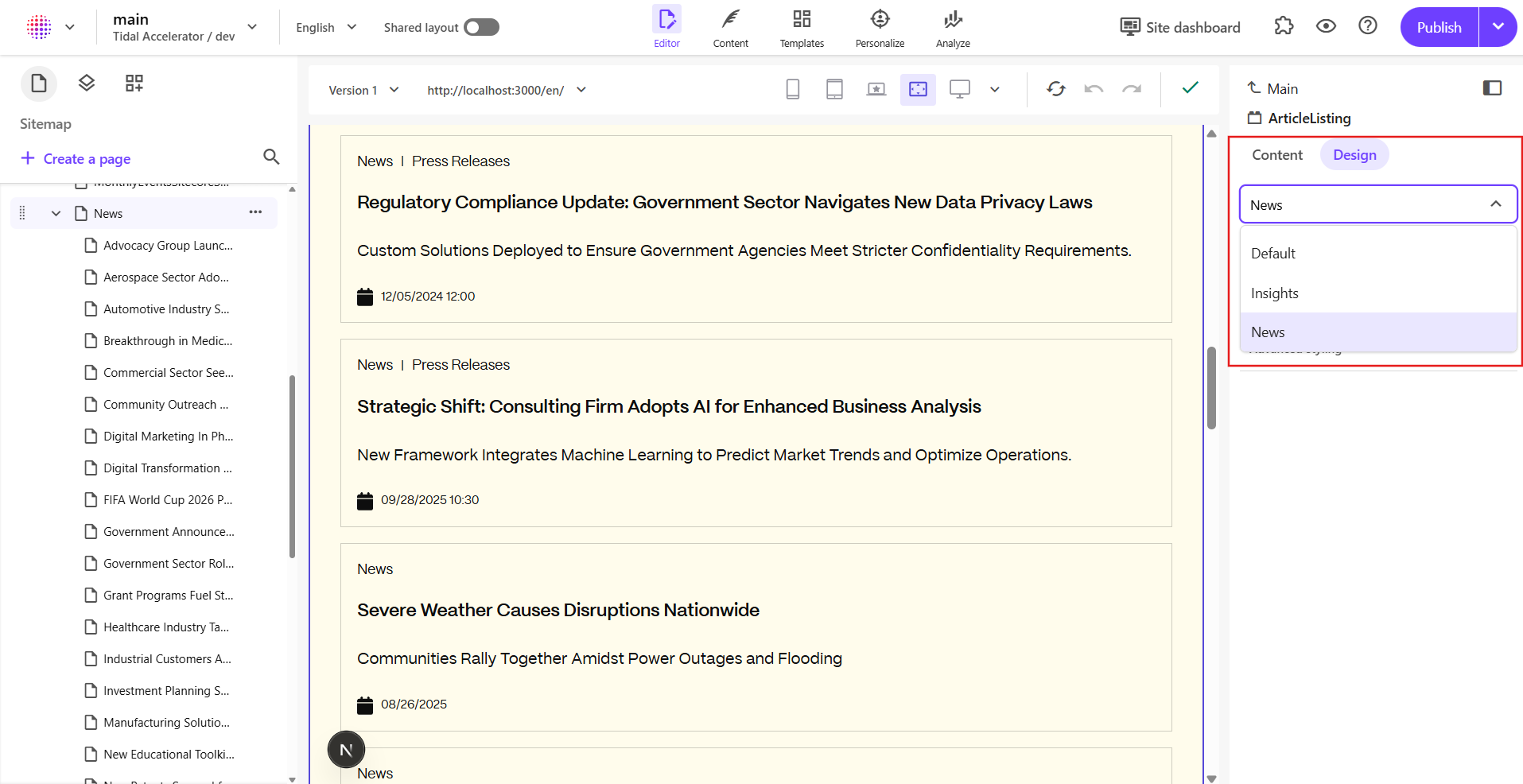
In headless Sitecore, a variant is typically a named export from your component module (for example Default, Insights, News) that the component map wires to the Sitecore rendering variant (or equivalent) choice. Each variant is a different React entry point: it can wrap the same inner UI with different props, or call different data-loading paths.
In this repo, ArticleListing is a clear illustration. The file exports three variants (Default, Insights, and News) each routing to a shared ArticleListingRendering with a resolved variant:
Content Editor
Page Builder
In the code
// ArticleListing variant wrapper components
const ArticleListingDefault = (props: ArticleListingProps): JSX.Element => {
  const params = props.rendering?.params || {};
  const variant = (params.Variant as ArticleVariant) || ARTICLE_VARIANTS.DEFAULT;
  return (
    <Frame params={props.params}>
      <ArticleListingRendering {...props} variant={variant} />
    </Frame>
  );
};
const InsightsArticleListing = (props: ArticleListingProps): JSX.Element => {
  const variant = ARTICLE_VARIANTS.INSIGHTS;
  return (
    <Frame params={props.params}>
      <ArticleListingRendering {...props} variant={variant} />
    </Frame>
  );
};
const NewsArticleListing = (props: ArticleListingProps): JSX.Element => {
  const variant = ARTICLE_VARIANTS.NEWS;
  return (
    <Frame params={props.params}>
      <ArticleListingRendering {...props} variant={variant} />
    </Frame>
  );
};
Those symbols are what authors pick in the editor; the default variant can still read a parameter (Variant) for flexibility, while Insights and News fix the mode in code.
Constants keep the contract explicit:
// Article variant constants and types
export const ARTICLE_VARIANTS = {
  DEFAULT: 'Default',
  INSIGHTS: 'Insights',
  NEWS: 'News',
} as const;
export type ArticleVariant = (typeof ARTICLE_VARIANTS)[keyof typeof ARTICLE_VARIANTS];
Server-side data loading uses the same idea: getComponentServerProps calls getVariantFromRendering(rendering) so the correct GraphQL/listing query runs for that placement.
Styles / style tokens, dynamic placeholder segments where used).Code tie-in: Frame / FrameProvider and Button (via useFrame) are parameter-driven from params.Styles — no new React export for every theme; authors change presentation / style tokens in Sitecore.
Variant=News every time."getComponentServerProps in ArticleListing fetches a different result set per variant. That is easier to reason about as separate named exports than as one giant switch.Code tie-in: Insights and News in ArticleListing.tsx exist so the editor picks a first-class variant instead of relying on a free-text parameter for critical behavior.
| Topic | Rendering parameters | Headless variants |
|---|---|---|
| What it is | Key/value configuration on the rendering instance | Named exports + Sitecore mapping to the same component |
| Typical use | Styling, toggles, IDs, platform keys | Distinct author-facing modes with different UI or data paths |
| Editor experience | Parameter panel (fields depend on your rendering item) | Variant picker; very visible intent |
| Code structure | One component, branch on params | Multiple exports, can share an inner core component |
| Data fetching | getComponentServerProps (and similar hooks) read rendering.params | Each variant can still use the same getComponentServerProps, or you branch inside it (as in ArticleListing) |
Add a new headless variant when the same Sitecore rendering still makes sense (same placeholder, same datasource shape, same high-level purpose) but you need a meaningful branch — especially for data or author mental model. Add a new component when:
In this starter, ArticleListing shares one ArticleListingRendering and uses variants for which article family to load. If "listing" and "grid of promotional cards" diverge completely, that is a new component, not a twelfth variant.
Standard Values in Sitecore should align with what the app reads. In ArticleListing, the default path uses params.Variant, while getVariantFromRendering (used for server props) maps from FieldNames:
export function getVariantFromRendering(rendering: ComponentRendering): ArticleVariant {
  const params = rendering?.params || {};
  // Simply use FieldNames parameter as variant
  return (params.FieldNames as ArticleVariant) || ARTICLE_VARIANTS.DEFAULT;
}
Whether you standardize on SXA's FieldNames, a custom Variant, or both, document and enforce one convention (and keep Sitecore standard values, branches, and TypeScript in sync).
Rendering parameters and headless exports are a contract between Sitecore and your app. When that contract changes, published pages can break silently (wrong theme, wrong data, or missing component map entries).
param key, a theme: token, or a named export used in the component map, either support old and new values in code for a release or two, or batch-update content (layout / final rendering) so nothing still references the old name.theme:primary, theme:secondary, theme:tertiary from Presentation → Styles → Color Theme), and headless variant branches should be understood by the build that is live; avoid leaving authors with options the current bundle does not implement.Default / Insights / News pattern in ArticleListing.The flexibility Sitecore offers is a feature; the discipline in how you model parameters and variants is what keeps the codebase readable for the next team — and predictable for content authors.