Reading time: 17 min read
Best websites in energy: Who's setting the digital standard in oil and gas in 2026?
How the biggest names in oil and gas are (or aren't) bringing their market leadership online.
Start typing to search...
How the biggest names in oil and gas are (or aren't) bringing their market leadership online.
In B2B industries where procurement cycles are long, buying committees are large, and reputation travels ahead of every conversation, the website is doing more work than most companies give it credit for. It is the first stop for a partner evaluating capabilities, a regulator looking for transparency, or a recruit deciding whether this is the kind of company worth joining. By the time anyone picks up the phone, the homepage has already made an impression. In oil and gas, where the stakes are high and the players are few, that impression carries weight.
This is the latest post in Fishtank's latest series, evaluating the homepages of industry leaders against a consistent, human-reviewed framework. The series launched with Best websites in professional services, covering management consulting, legal, and architecture. This edition turns to four integrated oil and gas majors: ExxonMobil, Shell, Chevron, and BP. These are four of the largest companies on earth by revenue. What follows is an honest assessment of how well each firm has built its front door.
Fishtank is a Platinum Sitecore partner headquartered in Calgary, Alberta. We work in the same city as many of the companies we evaluate, and we have spent years building websites for firms operating in complex, high-stakes industries. That combination of platform expertise and proximity gives us a ground-level view of how energy companies present themselves digitally, and how often that presentation falls short of the market position they have earned.
This evaluation focuses exclusively on the homepage of each firm's website. Not the full site, not a content audit. The homepage is the primary validation layer for anyone doing independent research before making contact. It is often the first and only page a prospective partner, investor, or recruit will see. That is the unit of analysis.
I visited each homepage directly and assigned every score myself. AI assisted with drafting and synthesis. The evaluation criteria and ratings are mine.
| Category | What we're looking at | Output |
|---|---|---|
| What they say | Messaging, audience clarity, differentiation, and whether the language is specific or generic | 1–4 rating |
| How they present it | Video, motion, interactivity, visual polish, and hierarchy | 1–4 rating |
| How they organize it | Navigation items, footer, clicks to content, search function, and scannability | 1–4 rating |
| What they want you to do | Primary CTA, proof points, lead-gen approach, and next step clarity | 1–4 rating |
| How current it feels | AI features, content freshness, design currency, last redesign, and mobile experience | 1–4 rating |
Each checkpoint is either a yes/no, a short written observation, or a 1 to 4 rating with defined criteria. Every score comes from a human visiting the site (a.k.a. me), with nothing inferred or estimated.
Where a judgment call is unavoidable, we use a 1 to 4 scale:
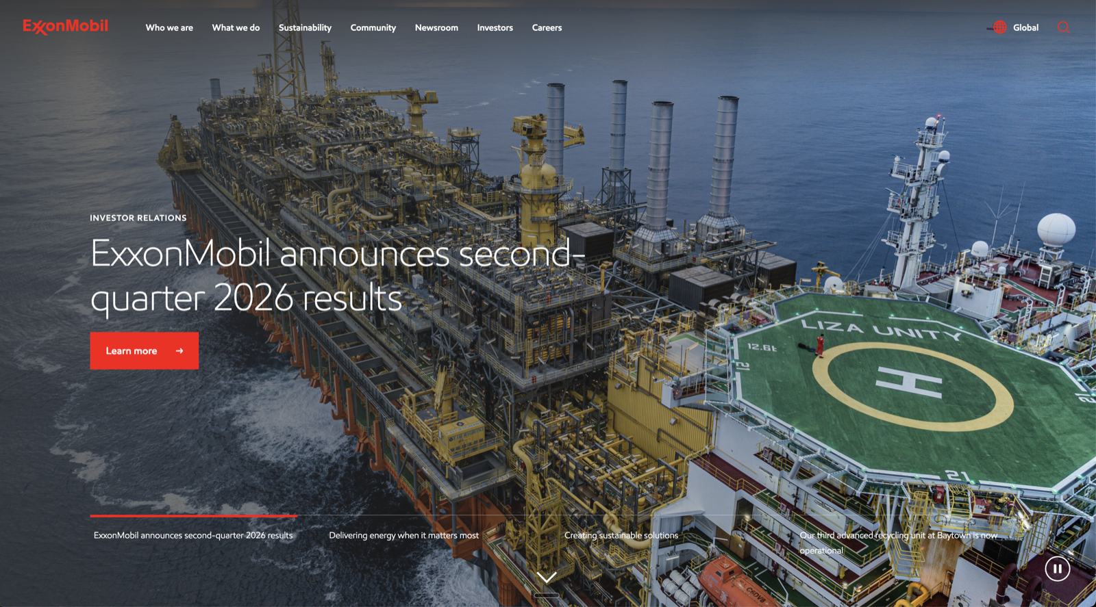
The screenshot above is from my August 2026 visit to corporate.exxonmobil.com. The hero is a rotating carousel and the slides were cycling through financial announcements on arrival.
The headline tells you who this homepage is built for. "ExxonMobil announces second-quarter 2026 results" is the first thing a visitor sees, above the fold, in the largest type on the page, and every slide in the carousel follows the same logic: investor relations news, operational updates, corporate announcements. A prospective partner, recruit, or business buyer arrives to find content that was not made for them.
The tagline exists, but you have to scroll past the carousel to find it. "The need for energy is universal. That's why ExxonMobil scientists and engineers are pioneering new research and pursuing new technologies to reduce emissions while creating more efficient fuels" sits in a navy band below the fold, visually subordinate to the news feed above it. It is broad enough to apply to any energy company on earth, and it does not tell you who ExxonMobil is talking to, what problems they solve, or why they are the right partner for anything specific.
Below the fold, the page organizes itself around internal divisions rather than buyer needs, moving through Trending topics, Our global organization, and Our global brands in an order that reflects how the company thinks about itself rather than how a visitor might want to navigate it. The stock ticker sits prominently mid-page, and the seven-item navigation offers no obvious signal about which audience the site is primarily serving.
A Wayback Machine check confirmed the current design is not materially different from August 2019, which means seven years have passed without a meaningful structural update to a homepage that represents one of the largest companies on earth. There are no visible AI features, no interactive tools, and no personalization signals anywhere on the page, which is a notable gap for a company that publicly positions itself as a technology-forward energy innovator.
Against the framework, ExxonMobil scores 1 out of 4 on what they say and what they want you to do, and 2 out of 4 on presentation and organization. How current it feels earns a 1, confirmed by the Wayback check.
Total: 7 out of 20.
At a glance:
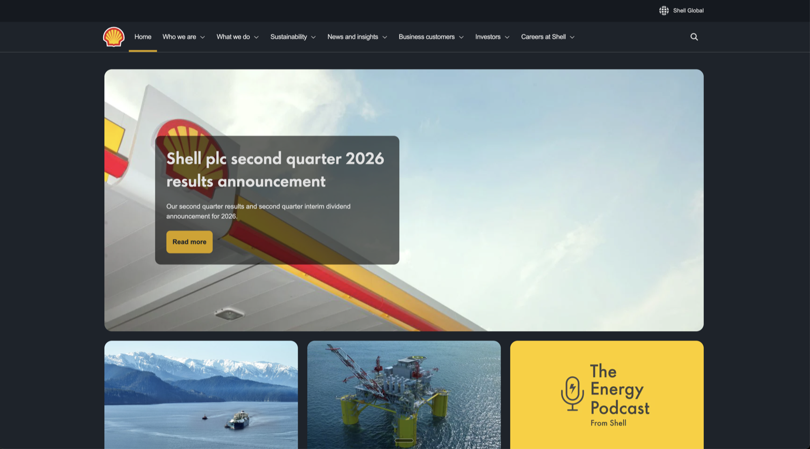
The screenshot above is from my August 2026 visit to shell.com. The hero image was static on arrival, with the quarterly results announcement sitting in an overlay card on the left side of the frame.
Shell leads with the same investor-first reflex as ExxonMobil, but the homepage recovers more quickly once you move past the fold. The hero carries the second quarter 2026 results announcement with a yellow 'Read more' button, which is a familiar pattern by this point in the evaluation. What is less familiar is what comes next: three content cards covering the Shell LNG Outlook 2026, a Gulf of Mexico project update, and The Energy Podcast from Shell. These are choices that reflect a content strategy rather than a press release queue, and they signal that someone has thought about what a visitor might actually want to read.
Shell has no standing tagline on the homepage, but the Featured content section mid-page carries four tiles covering strategy, climate, careers, and stories, each with a short descriptor that edges toward positioning without fully committing to it. 'Shell's purpose is to power progress together, by working with each other, our customers and our partners' appears under the strategy tile, which is purposeful language without being particularly specific about who Shell is talking to or what it wants them to do.
The navigation is where Shell pulls ahead of the rest of the group. A dedicated Business customers dropdown is the only explicit acknowledgement of a commercial audience in the nav across all four homepages evaluated, and it matters because it signals an intentional design decision rather than an oversight. The How can we help? section mid-page reinforces this by surfacing three functional tools: Job search, Shell station locator, and Shell Card. It is the most practically useful moment on any homepage in this evaluation, and the fact that it sits halfway down the page rather than above the fold is the most telling design gap Shell has.
There are no visible AI features, no interactive tools, and no personalization signals on the page, though the Digitalization link in the You may also be interested in section at the bottom suggests Shell is at least aware of the conversation happening elsewhere in the industry.
Against the framework, Shell scores 2 out of 4 on what they say and what they want you to do, and 3 out of 4 on presentation and organization. How current it feels earns a 2.
Total: 12 out of 20.
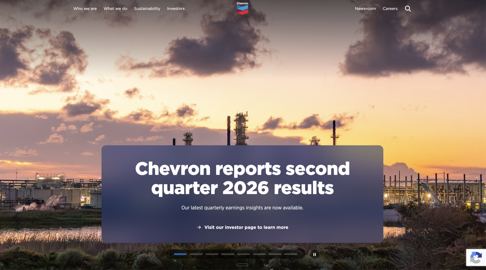
The screenshot above is from my August 2026 visit to chevron.com. The animated identity section does not translate to a static image, and the full-screen typographic experience is worth visiting directly.
Chevron has made a deliberate design choice that most large energy companies have avoided: it has invested in brand identity at the expense of immediate commercial clarity, and the result is the most visually distinctive homepage in this evaluation. The hero structure is two-layered, with a narrow banner carrying 'Chevron reports second quarter 2026 results' at the top and a full-screen animated section cycling through 'critical thinkers,' 'collaborators,' and 'innovators' under the label 'Who we are' immediately below it. The IR announcement feels like an obligation that has been acknowledged and moved past as quickly as possible, while the identity section feels like the homepage Chevron actually wanted to build.
The mission statement that follows reinforces the people-first positioning: 'We believe that humanity can solve any challenge, that our greatest resource is our people, and that responsibility, trust and integrity will help us drive a prosperous future.' It is values-forward language that reads as genuine rather than corporate. The brand line 'the human energy company' carries the same conviction. The problem is that it appears in the footer, which is where positioning assets go when no one has made the case for giving them prime real estate.
The What we do section mid-page carries the headline 'Energy that fuels the world' with a scattered photography grid and a 'See our solutions' CTA, but the visual treatment prioritizes texture over information and a first-time visitor learns relatively little about what Chevron actually does or who it serves. The editorial flow of the homepage rewards a visitor who is already predisposed to engage with Chevron's brand story, but it does not work as hard for someone in active evaluation mode who needs a commercial path quickly.
The navigation has been pared back to four items: Who we are, What we do, Sustainability, Investors. It is clean and confident, and it reflects the same design philosophy as the rest of the page. There are no visible AI features or interactive tools, but the overall visual sophistication of the homepage suggests a team that has made considered decisions about where digital is going, even if conversion has not yet been brought into that conversation.
Against the framework, Chevron scores 4 out of 4 on presentation, 3 out of 4 on how current it feels, and 2 out of 4 on what they say and how they organize it. What they want you to do earns a 1.
Total: 12 out of 20.
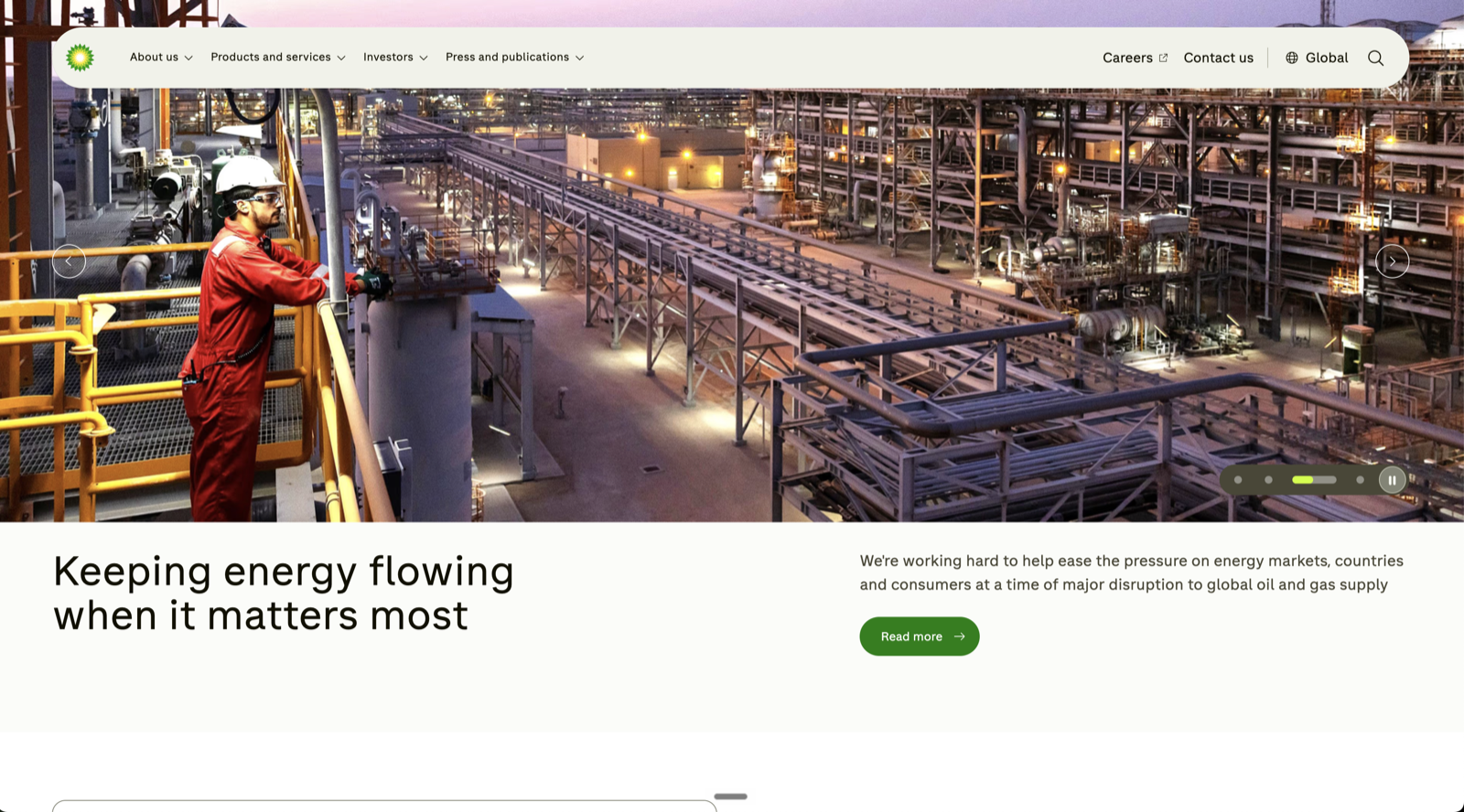
The screenshot above is from my August 2026 visit to bp.com. The homepage has been meaningfully redesigned since earlier this year, and the structural problems that defined the previous version have been addressed.
The most significant change is the navigation. The nine-item left-rail vertical column that previously dominated the layout is gone, replaced by a clean horizontal nav with four items: About us, Products and services, Investors, and Press and publications. It is a straightforward improvement that makes the page immediately more legible, and it signals that someone has made a deliberate decision about what the homepage is supposed to do.
The hero now carries 'Stronger earnings and priorities to accelerate delivery' as the primary headline, which is still investor-facing but considerably less operationally specific than the asset divestiture announcement that led the previous version. More notable is a company description box that sits below the hero: 'bp is a global integrated oil and gas company. We produce oil and gas, trade energy and make, ship and sell energy products... Our purpose is to deliver energy to the world, today and tomorrow.' It is plain and functional, and it is the only explicit company description on any homepage in this evaluation. The fact that it reads more like a Wikipedia summary than a positioning statement suggests BP is still working out what it wants to say about itself, but the presence of any orienting statement at all is a step forward from what was there before.
Below the hero, four audience tiles cover Latest news, Investors, Sustainability, and Careers with clear visual organization, and the Investors section has been moved mid-page rather than dominating the above-fold experience. The news section is now filterable by All, Press releases, Publications, and Energy in focus, which is a clean replacement for the 405-page paginated press archive that previously functioned as a homepage feature.
The homepage still does not have a commercial CTA oriented toward a business buyer or partner, and the primary above-fold action remains 'Read more' tied to the quarterly results. The addition of a Products and services nav item is a meaningful signal that a commercial audience has been acknowledged, even if the homepage has not yet been built around their needs.
Against the framework, BP scores 2 out of 4 on what they say, how they present it, and how current it feels, and 3 out of 4 on how they organize it. What they want you to do earns a 2, up from a 1 in the previous version.
Total: 11 out of 20.
| Category | ExxonMobil | Shell | Chevron | BP |
|---|---|---|---|---|
| What they say | 1/4 | 2/4 | 2/4 | 2/4 |
| How they present it | 2/4 | 3/4 | 4/4 | 2/4 |
| How they organize it | 2/4 | 3/4 | 2/4 | 3/4 |
| What they want you to do | 1/4 | 2/4 | 1/4 | 2/4 |
| How current it feels | 1/4 | 2/4 | 3/4 | 2/4 |
| Total | 7/20 | 12/20 | 12/20 | 11/20 |
Shell and Chevron lead the group with equal scores but for entirely different reasons. Shell earns its points through content strategy, audience awareness, and structural organization. Chevron earns its through design ambition and visual currency. BP's redesign has moved it meaningfully up the table. ExxonMobil sits at the bottom, not because it is broken, but because it has not changed.
Every homepage in this group leads its hero with a financial announcement. Earnings results, corporate plan updates, quarterly results declarations. This is a structural choice that reveals who these companies believe their homepage audience to be: investors, analysts, and financial press. The problem is that the homepage is also the first stop for prospective partners, business customers, talent, and regulators. When the hero rotates through IR announcements, every other audience type arrives to find content that was not made for them.
A dedicated investor relations section: prominent, accessible, clearly signposted in the nav, would serve financial stakeholders without sacrificing the homepage's ability to speak to everyone else. None of the four firms have fully made that design decision. The result is a homepage architecture that reflects internal organizational priorities rather than external audience needs.
Chevron is the most interesting case study in this group precisely because it has made the most design investment and still produced a homepage that is difficult to use commercially. 'Critical thinkers, collaborators, innovators' is a confident identity statement. 'The human energy company' is a distinctive brand line. But a prospective industrial partner visiting chevron.com for the first time cannot easily answer: what does Chevron do that is relevant to me, and how do I find out more?
Brand personality and commercial clarity are not in opposition, but they require deliberate integration. The best B2B homepages lead with a strong point of view and still make the next step obvious. Chevron has the first half. The second half is the work still to do.
A Wayback Machine check on ExxonMobil confirms the current homepage design is not materially different from August 2019. Seven years, structurally unchanged. BP, by contrast, has visibly redesigned its homepage within the period of this evaluation — the left-rail navigation is gone, the nav is cleaner, the page hierarchy has improved. The gap between a site that was built well in 2018 and a site that is genuinely useful in 2026 is wider than it looks from the inside. BP's redesign shows that the gap is closable. ExxonMobil shows what it costs to leave it open.
Across all four homepages, there is not a single visible AI feature. No conversational interface, no intelligent search, no personalization signal, no interactive tool. For an industry that is actively investing in AI for exploration, production, logistics, and safety, and publicizing those investments in press releases, the homepage is the one place where none of that capability is on display. The consulting firms evaluated earlier in this series (McKinsey, Deloitte, PwC) have made their AI capabilities part of the homepage experience. Oil and gas has not. Whether that is a considered choice about audience expectations or a genuine lag in digital maturity, the effect is the same: a visitor researching these firms' technological credentials finds nothing interactive to validate the claim.
Each of these four firms is navigating the energy transition differently. ExxonMobil is doubling down on hydrocarbons with targeted investment in carbon capture. Shell's latest news feed is dominated by asset disposals and renewable divestments. Chevron is playing a long game. BP is simplifying and refocusing. These are genuinely different strategic positions, and none of them are clearly articulated on the homepage. The transition narrative is one of the most consequential business strategy questions of the decade, and the firms that find a way to state their position clearly and credibly on the homepage will be better positioned in every conversation that follows.
In high-stakes B2B procurement, the homepage is evaluated not just for information but for signal. What does this company think is important enough to put at the front? How does it organize complexity? What does it show you before you ask? For oil and gas majors operating under regulatory scrutiny and shifting partner expectations, the homepage is one of the few places where strategic priorities are visible without a filter. Right now, the dominant signal across this group is financial. That may be an accurate reflection of where each firm is focused. It is worth asking whether it is the signal each firm wants to be sending to every other audience type that lands on the homepage.
The firms winning the digital credibility conversation in adjacent sectors (consulting, legal, financial services) treat the homepage as the entry point to a larger system: thought leadership engines, interactive tools, intelligent content surfaces, gated client environments. The homepage is not the destination; it is the door. Oil and gas homepages currently function as destinations. The content is there, but it does not connect to anything. As buyer research behaviour continues to shift toward self-directed digital evaluation, the firms that build connected digital ecosystems will have a structural advantage in procurement conversations that begins before a single human interaction takes place.
Each of these firms is navigating the energy transition at a different pace and in a different direction. Those are genuinely different stories, and none of them are clearly told on the homepage. The firms that find a way to articulate their position clearly, credibly, and consistently on the homepage will be better positioned in every conversation that follows: with partners, regulators, investors, and talent. Right now, that position is mostly absent, or buried below the fold behind a quarterly earnings announcement.
Fishtank has spent over two decades building websites for firms that operate in complex, high-stakes industries where expertise is the product and the homepage is the first proof of it. The patterns in this evaluation are not unique to oil and gas. Generic positioning, buried conversion paths, AI talked about rather than demonstrated, design decisions made years ago and never revisited. These are strategic problems, and they appear in every vertical where a firm's digital presence has not kept pace with its ambitions.
If you read this evaluation and recognized your own homepage in one of the weaker profiles, that is a starting point. As a Sitecore partner headquartered in Calgary, we bring platform expertise and industry proximity that most agencies cannot offer in the energy sector. We build websites that work as hard as the firms behind them, and we would be glad to show you where yours stands. Start at getfishtank.com.