Reading time: 14 min read
Best websites in professional services: Who's setting the digital standard in 2026?
How industry leaders in professional services are (or aren't) translating market dominance into digital clarity.
Start typing to search...
How industry leaders in professional services are (or aren't) translating market dominance into digital clarity.
Fishtank has been building websites for a long time. Not just building them, but living in them: studying what works, documenting what doesn't, and forming strong opinions about both. The firms that win digitally are not always the biggest or the best funded. They are the ones that treat their website as a strategic asset rather than a line item. This is the first post in a new series where I evaluate the best websites across the professional services industry. Each article looks at four of the most prominent firms in a specific vertical and puts their digital presence through the same observable framework. Same criteria, every time. I want to be clear upfront: what follows is my opinion, informed by Fishtank's methodology and years of building professional services websites. It is not a paid ranking. It is not a comprehensive audit. It is a direct, honest read of what I saw when I visited each homepage. We start with professional services because the stakes are high, the brands are famous, and the gap between reputation and digital execution is more interesting than you might expect.
A note on scope before we get into the firms. This evaluation focuses specifically on the homepage of each professional services website. Not the full site, not a deep-dive into content architecture. The homepage is the front door, and in B2B sales cycles where buyers complete the majority of their research independently before making contact, that front door does more work than most firms realize. Our framework is built from observable checkpoints: things I can see, read, or click on a single site visit. No black box scoring, no AI-generated benchmarks. I visited each homepage, worked through the checklist, and recorded what was actually there. The analysis and opinions are mine, based on the criteria below and applied consistently across all four firms. So let's get into it!
| Category | What we're looking at | Output |
|---|---|---|
| What they say | Messaging, audience clarity, differentiation, and whether the language is specific or generic | 1–4 rating |
| How they present it | Video, motion, interactivity, visual polish, and hierarchy | 1–4 rating |
| How they organize it | Navigation items, footer, clicks to content, search function, and scannability | 1–4 rating |
| What they want you to do | Primary CTA, proof points, lead-gen approach, and next step clarity | 1–4 rating |
| How current it feels | AI features, content freshness, design currency, last redesign, and mobile experience | 1–4 rating |
Each checkpoint is either a yes/no, a short written observation, or a 1 to 4 rating with defined criteria. Every score comes from a human visiting the site (a.k.a. me), with nothing inferred or estimated.
Where a judgment call is unavoidable, we use a 1 to 4 scale:
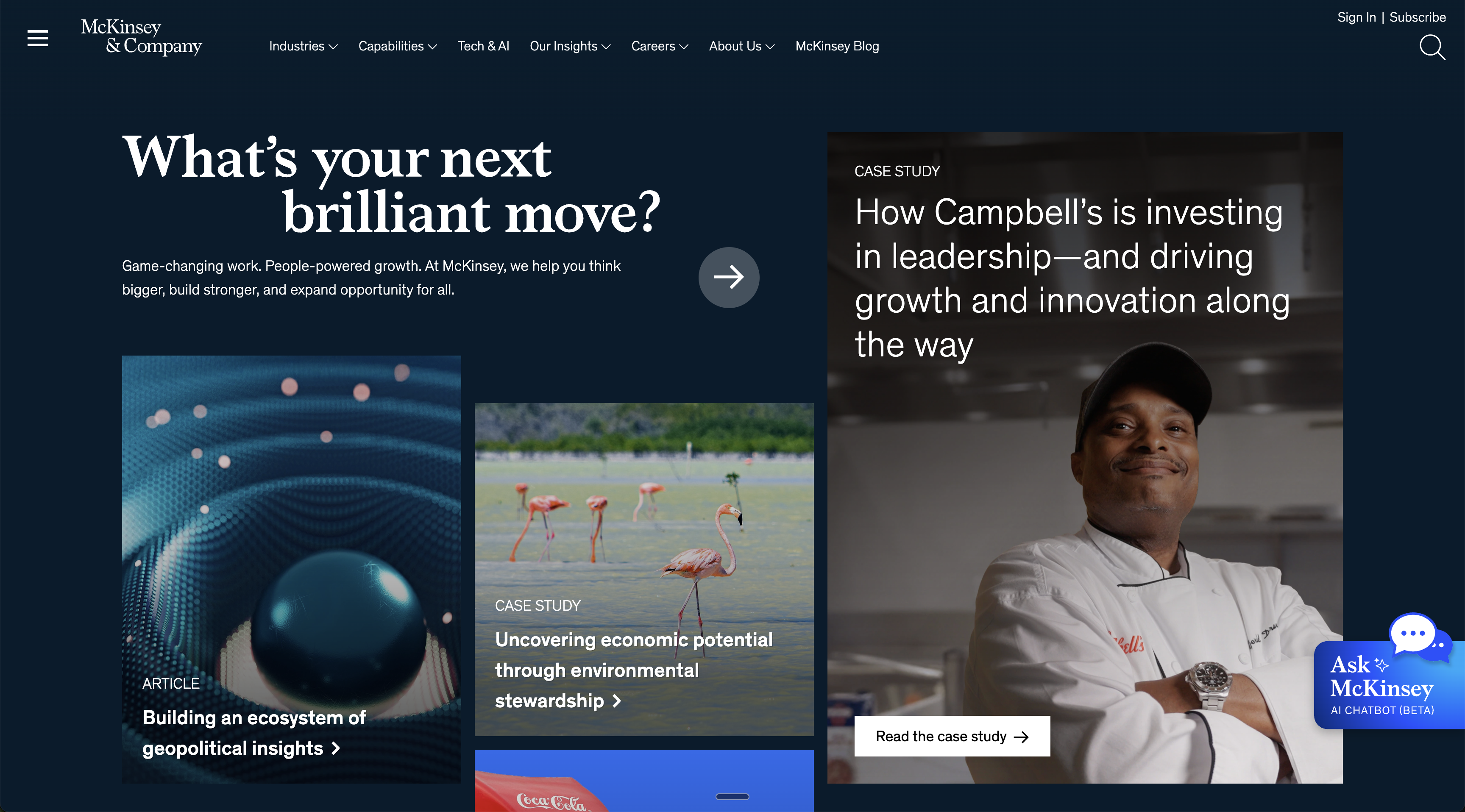 The screenshot above is from my March 2026 site visit to mckinsey.com. The live experience is worth seeing for yourself, the animation and Ask McKinsey are things a static image cannot capture.
The headline tells you something has shifted. "What's your next brilliant move?" is not what you expect from a brand that has spent a century leading with its own prestige. It is customer-outcome framing, and it works. The subheadline reinforces it: game-changing work, people-powered growth, AI-driven results. McKinsey is not asking you to admire them. They are asking what you need.
The case study grid does the audience targeting without stating it explicitly. Campbell's growth strategy, geopolitical trade intelligence, CEO and board agendas. If you are not in that room, you know within seconds this homepage is not for you. If you are, you feel seen before you have clicked anything.
Where McKinsey genuinely pulls ahead is Ask McKinsey, a generative AI chatbot live on the homepage and accessible from the Insights nav. You type a question, you get a cited answer drawn from over 100,000 published documents. No other professional services homepage in this evaluation does anything like it. That is a product decision, not a marketing claim.
The tension is structural. McKinsey is running a media company and a consulting firm on the same homepage, and the consulting firm sometimes loses. Capabilities sit below the fold behind a podcast section and a video carousel. In my opinion, a buyer in active evaluation mode has to work harder than they should to find a commercial path.
One more detail: a Purdue Pharma deferred prosecution notice is pinned to the footer. Bold transparency, but an unusual thing to encounter on a firm's primary digital front door.
Against our framework, McKinsey earns 4 out of 4 on presentation and digital currency, driven by the live AI feature and kinetic design. It drops to 2 out of 4 on organization and conversion, where the editorial model buries the commercial path. Total: 15 out of 20.
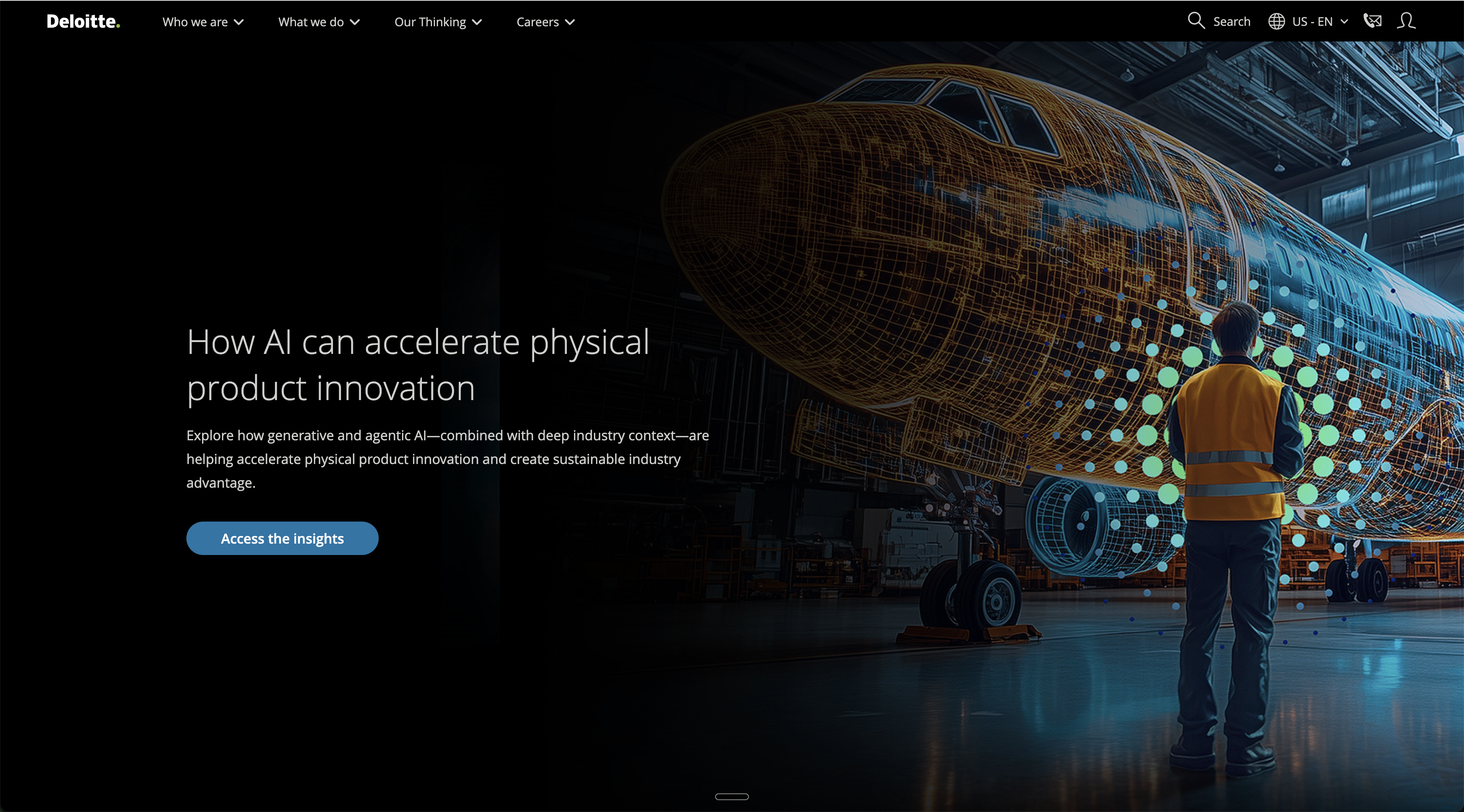 The screenshot captures the Deloitte homepage from my March 2026 visit, but the live experience is notably more polished than any still image suggests. The motion and video transitions are worth seeing directly.
Deloitte does not lead with a permanent positioning statement. The hero rotates between content spotlights, so different buyers land on different first impressions depending on the day. The actual brand message, "Connecting the dots. That's how progress happens," sits below the fold. For a firm of this scale, that is a meaningful structural choice, and whether it works depends entirely on whether your buyer arrives with existing context.
What Deloitte does better than anyone else in this evaluation is production quality. The video-animated hero, deliberate motion, and distinctive green CTAs make this the most visually polished homepage of the four. The design investment is visible and the experience is premium.
The conversion architecture is where it loses ground. Five or more CTAs compete across the page with no clear hierarchy. The Submit RFP path, critical for buyers running formal procurement processes, lives only in the footer after a full page scroll. Notably, Deloitte's 2016 homepage gave Submit RFP equal prominence alongside Contact Us and Search Jobs. A decade of redesigns have made the site more beautiful and the buyer journey harder to navigate.
AI is present throughout as a topic and service category, but not as a live feature on the homepage itself.
Against our framework, Deloitte earns 3 out of 4 across most categories, with production quality and navigation being genuine strengths. It drops to 2 out of 4 on conversion, where the lack of CTA hierarchy and the buried RFP path cost it. Total: 14 out of 20
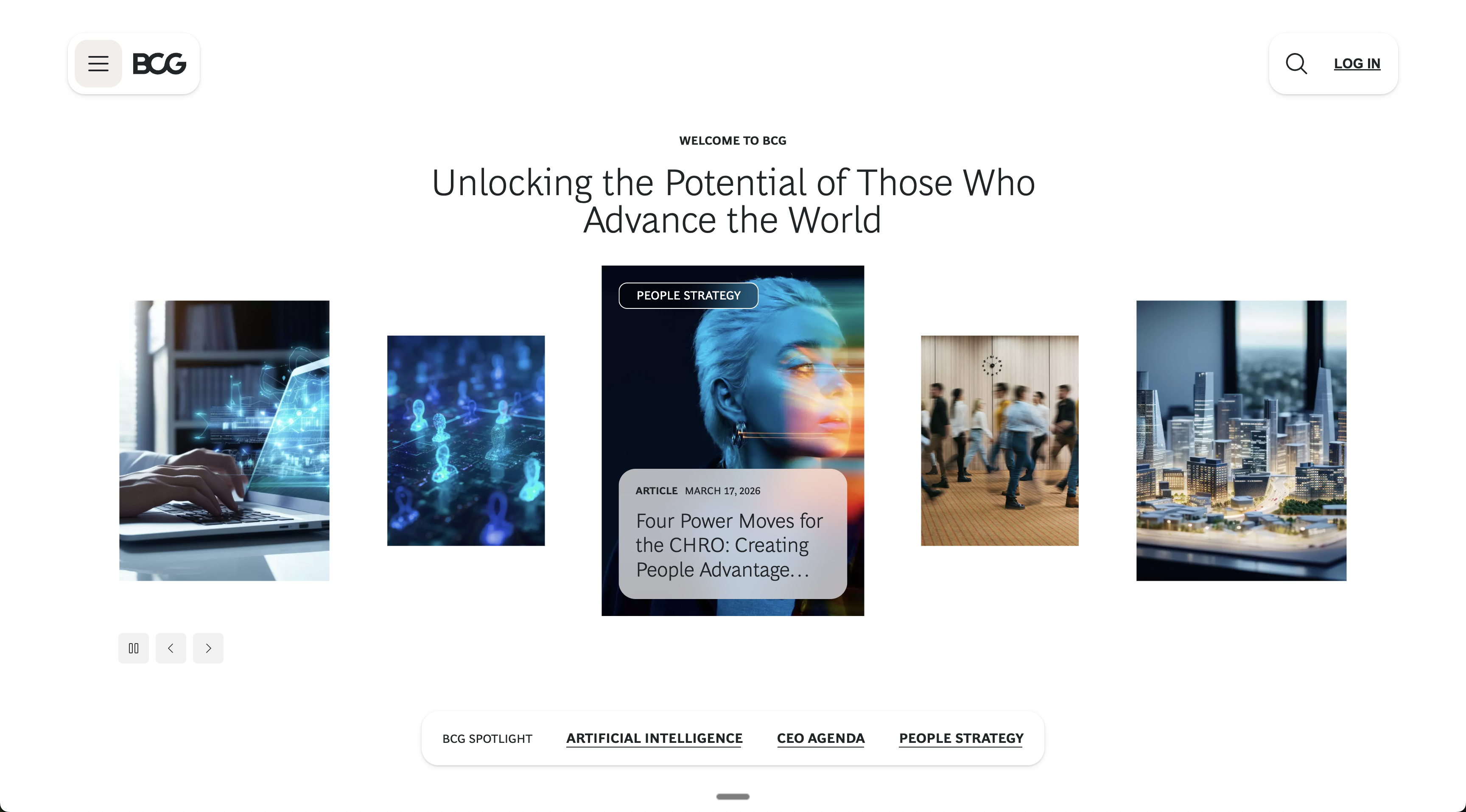 The BCG homepage is clean and restrained, which comes through even in a screenshot. The live experience confirms it: no motion, no animation, no surprises.
BCG opens with "Unlocking the Potential of Those Who Advance the World," with the italics on "Those Who Advance the World" doing quiet but deliberate work, centering the client rather than the firm. Directly below, a "How can we assist you today?" section presents Capabilities and Industries dropdowns and asks visitors to self-select rather than browse a traditional menu. In my view, it is the most buyer-centric information architecture feature across all four homepages, and it deserves more credit than it typically gets.
The rest of the homepage is restrained to the point of flat. No video, no motion, no interactive AI feature. BCG has genuine AI capability through BCG X and a documented OpenAI partnership, but none of that is visible as a live experience. The gap between what BCG is building and what their homepage communicates is the most significant disconnect I found in this evaluation.
The commercial path is the least visible of all four firms. Contact Us lives only in the footer with no above-the-fold CTA of any kind. For a firm serving more than two thirds of the Fortune 500, the assumption seems to be that buyers already know why they are here, which may hold for warm referrals but is a real gap for anyone arriving cold.
Against our framework, BCG earns 3 out of 4 on messaging and organisation, where the self-select dropdowns and considered headline do real work. It drops to 2 out of 4 on conversion and presentation, where the static design and absent CTA architecture hold it back. Total: 15 out of 20
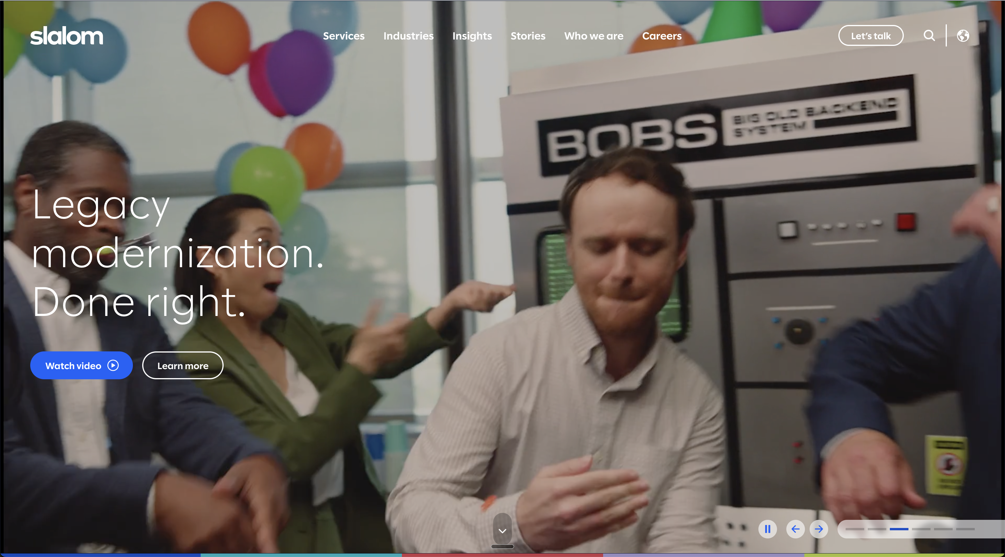 This screenshot of Slalom's homepage gives a sense of the energy, but the live site is more dynamic. The hero transitions between images and video, and several sections animate through copy and logos as you scroll.
Slalom is the most complete professional services homepage of the four, and it is not a close comparison. "Perspective is power" opens the hero, a bolder headline than the "fiercely human" positioning the brand is known for. That framing has not gone anywhere though — it shows up in the supporting copy: "a fiercely human business and technology company that leads with outcomes and teams with leaders." The homepage is structured to prove that distinction rather than simply claim it.
"Speak with us" sits above the fold, the clearest and most direct buyer CTA of all four homepages I evaluated. Named client logos, testimonials, AI outcome metrics, press coverage, and partner logos are all visible without a single click. The 2026 Outlooks section, organized by industry across eight verticals, makes audience segmentation explicit from the moment you land. Customer case studies sit in the top-level navigation rather than buried two or three clicks deep. The footer closes with "Let's solve together," bookending the entire experience with an invitation to talk, which turns out to be a surprisingly rare thing in this vertical.
The one gap Slalom shares with Deloitte and BCG is that AI is referenced through outcome metrics and case studies rather than demonstrated as a live tool. That is what keeps the "how current it feels" score at a 3 rather than a 4. The design and energy are clearly there, but the live AI feature is not.
Against our framework, Slalom earns 4 out of 4 on presentation, and what they want you to do, the strongest conversion architecture of the four by a clear margin. It holds at 3 out of 4 across the remaining categories. Total: 17 out of 20
| Category | McKinsey | Deloitte | BCG | Slalom |
|---|---|---|---|---|
| What they say | 3/4 | 3/4 | 3/4 | 3/4 |
| How they present it | 4/4 | 3/4 | 3/4 | 4/4 |
| How they organize it | 2/4 | 3/4 | 3/4 | 3/4 |
| What they want you to do | 2/4 | 2/4 | 2/4 | 4/4 |
| How current it feels | 4/4 | 3/4 | 4/4 | 3/4 |
| Total | 15/20 | 14/20 | 15/20 | 17/20 |
Evaluating four homepages in the same vertical on the same day reveals patterns that individual reviews miss. Here is what stood out.
Three of the four firms in this evaluation are household names, and two of them have conversion architectures that would concern us if a client sent us their analytics. BCG has no above-the-fold CTA. Deloitte has five CTAs competing for attention with no clear hierarchy. McKinsey buries its capabilities section behind a podcast and a video carousel. The implicit logic seems to be that reputation does the selling, so the homepage does not have to. That holds until a buyer arrives without a prior relationship, and those buyers are the ones who pay the price.
Slalom, the smallest firm in this evaluation by revenue, has the clearest buyer journey of the four. That should give every firm on this list something to think about.
AI appears on all four professional services homepages in some form. Three of the four lead with it as a service category, a content topic, or a strategic narrative. McKinsey is the only firm that demonstrates it as a live product experience. Ask McKinsey changes the relationship between the visitor and the site: instead of browsing content, you have a conversation with it. That is a fundamentally different value proposition, and most visitors scroll past it without realizing what they just encountered. The gap between talking about AI and demonstrating it is where the next wave of competitive differentiation across professional services websites will be decided.
McKinsey and Deloitte have both made significant investments in content publishing: research reports, podcasts, newsletters, video series. Editorial content dominates the above-the-fold experience on both homepages, and commercial pathways are treated as secondary. This works for firms whose buyers do months of independent research before making contact. It works less well for buyers who arrive ready to talk and cannot find a straightforward way to start. The best professional services websites will need to do both, because content builds trust but clarity is what closes the gap.
Deloitte is the only firm in this evaluation where the homepage headline is a variable rather than a constant. McKinsey's "What's your next brilliant move?" is permanent and intentional. Slalom's "Perspective is power" is permanent and intentional. BCG's "Unlocking the Potential of Those Who Advance the World" is permanent and intentional. For a firm spending at the scale Deloitte spends on brand, a rotating hero that changes the first impression depending on the day is worth a serious internal conversation.
We are not going to tell you the future of professional services websites. What we can do is name the conversations worth having now, because the firms that start them early tend to end up with better websites than the ones that wait for a crisis to prompt a rethink.
Ask McKinsey is the most interesting thing McKinsey has built recently, and it is not a design element. It changes what the professional services website is: not a place you visit to find information, but a system you interact with to get answers. The firms that start thinking about their homepage as an operational interface rather than a digital brochure will have a structural advantage over those still optimizing hero sections and carousel timing.
Client logos and case study links have been the standard proof architecture for professional services websites for two decades, and they still matter. But the firms pulling ahead are the ones where expertise is experienceable rather than readable. McKinsey's chatbot, Gensler's open-source sustainability tools, West Monroe's Intellio platform. The professional services website stops being a sales tool and starts being a product, and that shift has significant implications for how firms think about content, technology, and the relationship between the two.
By the time a buyer makes contact with a professional services firm, research consistently shows they have already completed the majority of their evaluation independently. The homepage is doing more of the selling than the sales team is. Firms that design for the buyer who is already 70 percent of the way to a decision will convert at a higher rate than those designing for passive discovery. Clarity of next step is not a nice-to-have. It is a revenue question.
The conversation in professional services web design is moving beyond the homepage itself. The firms thinking clearly about where this is going are asking how their website connects to the rest of the business: CRM, content systems, client portals, AI tools, data infrastructure. A website that cannot talk to the systems around it is increasingly a liability. The future is not a better homepage but a homepage that knows who you are, what you need, and what to do with that information. Intelligence and orchestration, not just design and copy. The firms that treat their website as part of an ecosystem rather than a standalone asset are the ones worth watching.
Fishtank has spent years helping professional services firms close the gap between the company they are and the website they deserve. We have built and rebuilt professional services homepages and B2B digital presences across industries where expertise is the product and the homepage is the first proof of it. We know what a strong professional services website looks like because we have built enough weak ones to know exactly where they break.
The patterns I found in this evaluation show up across professional services broadly. Generic positioning, buried conversion paths, AI talked about rather than demonstrated, design decisions made in a different era and never revisited. These are not aesthetic problems but strategic ones, and they appear in every vertical where a firm's digital presence has not kept pace with its ambitions.
If you read this evaluation and recognized your own homepage in one of the weaker profiles, that is not an accident. It is an invitation. Fishtank builds professional services websites and digital presences that work as hard as the firms behind them. If you want to know where yours stands, we would be glad to show you.