Reading time: 7 min read
Mocking Multilingual Dictionaries from Sitecore XM Cloud in Storybook
Configure Storybook to show your Stories on every language set in your Sitecore site.
Start typing to search...
Using data sources for text content on renderings can be the best approach on most scenarios, but, when working on a XM Cloud project, especially with multiple languages, you can run into cases where you need some text content that is used multiple times, even on multiple renderings or pages. For example, the label for “Read more” button, a “Submit” label on forms, etc. Perhaps, some renderings might not need a lot of fields, just a place to author a couple of labels within it. Using the Dictionary can help with these scenarios.
However, if your project uses Storybook to create a component library, you will require some extra steps to make your components load the text coming from those Dictionary items. This blog will focus on how to set this up and get some mock data to populate that text on your Storybook file, so I will assume you are familiar with both tools and you already have them set up in your project, but if you would like to know more about either the Dictionary Sitecore XM Cloud or Storybook you can check these links below:
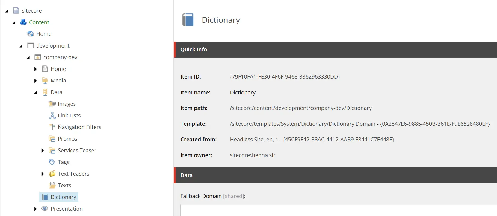
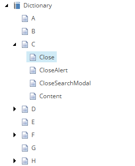
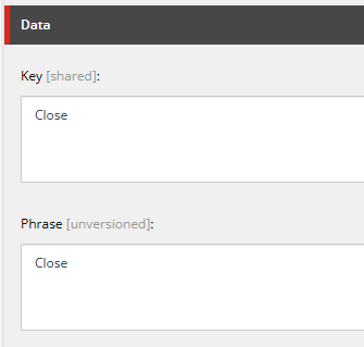
The first thing to do is check the current Dictionary items configured on the Content Editor, or if there are no items yet, you can add a couple to start with. In this example, the site uses an alphabetical structure just to make it easier for authors looking for the items, but the important thing is to have the correct Key and Phrase. To keep it simple, let’s just focus on the items under the C folder.
Now that you know which keys and phrases you will need to mock for Storybook, you can go ahead to the NextJS repository. Open the .storybook/preview.tsx file, which is the one responsible to render every story file when opening the Storybook dashboard. You can run this on the Terminal by using the command for the script found in package.json, in our case it looks like this:
// package.json
"storybook": "npm-run-all --serial storybook:bootstrap --parallel storybook:start start:watch-components"
In case the component you are working with doesn’t have a Story yet, here is a quick guide on how to quickly set it up: https://www.getfishtank.com/insights/a-comprehensive-guide-to-getting-started-with-storybook. Depending on your component, you might need some additional configuration specific to it. If you already have a Story for your component using a Dictionary item you will see that the component loads without the text, since the Dictionary item is returning a null value. Let’s fix this.
The localization or internationalization on your project might differ from this example, but the idea is to replicate on Storybook what is being done on the NextJS application. In the project showcased in this example, we are levering the I18nProvider from next-localization, the NextJS module for localization powered by Rosetta. This provider is set on _app.tsx wrapping the application that allows components to use . You can see the Basic Usage implementation example below:
//_app.tsx
import { I18nProvider } from 'next-localization';
import { useRouter } from 'next/router';
export default function MyApp({ Component, pageProps }) {
    const router = useRouter();
    const { lngDict, ...rest } = pageProps;
    return (
        <I18nProvider lngDict={lngDict} locale={router.locale}>
            <Component {...rest} />
        </I18nProvider>
    );
}
Similarly, you need to provide the Dictionary items to the component rendered on Storybook. In this example, we will setup mock data for English and French. In order to this, you need to go to the preview.tsx file under .storybook folder and add a couple of additional configuration to what is already existing on this file. You can follow these steps below:
globalTypes from ./config/preview.globalTypes and initialGlobals.
globals, we will set this to en.locale constant that takes the global value, with a fallback for English.locale attribute to the locale constant set on the previous step and the lngDict attribute with the mockDictionary object for the current locale.⚠️ You don’t need to remove or replace what’s already on preview.tsx, just make sure to add the necessary code for the mock data.
// .storybook/preview.tsx
// Step #1
import { I18nProvider } from 'next-localization';
import { globalTypes } from './config/preview';
// Step #2
const preview: Preview = {
  globalTypes: globalTypes,
  initialGlobals: {
      // ...
    language: 'en',
      // ...
  }, // ...
};
// Step #3
const mockDictionary = {
    en: {
        Close: 'Close',
        CloseAlert: 'Close alert',
        CloseSearchModal: 'Close search modal',
        Conent: 'Content'
    },
    fr: {
        Close: 'Fermer',
        CloseAlert: `Close l'alerte`,
        CloseSearchModal: 'Fermer le mode de recherche',
        Conent: 'Contenu'
    }
};
// Step #4
const locale = context.globals.language || 'en';
// Step #5
<I18nProvider locale={locale} lngDict={mockDictionary[locale]}>
    <div data-component="Storybook Preview">
        <Story params={defaultParams} />
    </div>
</I18nProvider>
Afterwards, you also need to add the globalTypes configuration for the language selection imported on the previous file from the config/preview.tsx file. The only thing needed in this file is to add the language property inside the exported globalTypes constant (you can add it in case it’s not already there). You can see the entire object properties on the code block below. This will help the users navigating the Storybook dashboard to change the locale value globally on the top selector and view the renderings on every language.
// .storybook/config/preview.tsx
export const globalTypes = {
// ...
language: {
    description: 'Language',
    toolbar: {
      title: 'Language',
      icon: 'globe',
      items: ['en', 'fr'],
      dynamicTitle: true,
    },
  },
// ...
}
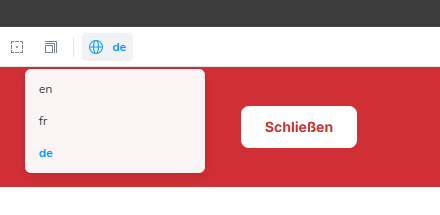
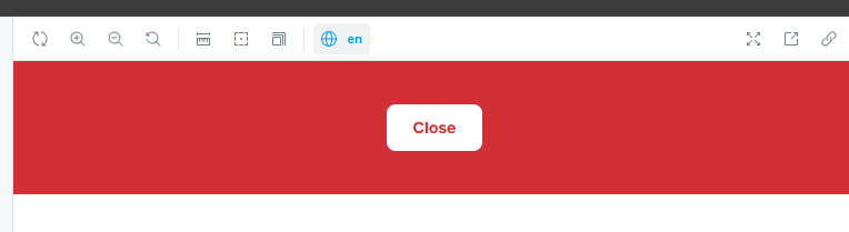
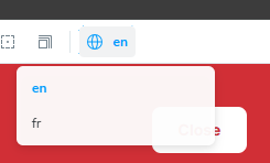
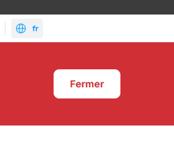
Now, if you run Storybook again, go to the same Story for your component. In our case, we will take a look at the Close Button example. You will notice the new option on the top ribbon to configure the locale value. Following the configuration for the globalTypes, we see the options en and fr for both of our locales, with en being the initial value. The button correctly displays the English label and when changing the global language value to fr, it changes it from Close to Fermer.
Just as a reference, this is a simple overview of how the TSX file looks for this button component:
// Example of next-localization and Dictionary implementation
import { useI18n } from 'next-localization';
const CloseButton: React.FC = () => {
  const { t } = useI18n();
  return <Button onClick={() => handleClose()}>{t('Close')}</Button>;
};
The main downside in this approach, is that you will need to update the mockDictionary object on the preview.tsx file every time you add, remove or edit any of the Dictionary items in Sitecore. Apart from this, however, since this solution is set globally, it doesn’t require any further configuration and quickly helps you visualize throughout the entire Storybook library, all the components that depend on the Dictionary text to render properly and avoid them loading empty. If you need an extra language added to your site in the future, let’s say German, you would need to add a new property in the mockDictionary, in this case de, typically used for Deutsch, and within it, add all the same keys used for English and French, but this time with the correct values for the equivalent German translations. Finally, you will need to append the ‘de’ string to the existing items array inside the language property from globalTypes to be able to select this new language from the top ribbon dropdown.