Customize Device Layouts in Sitecore XM Cloud Pages for Better Authoring and Preview
Take control of how your team previews content in Sitecore XM Cloud Pages by customizing default layouts, breakpoints, and visibility settings to match your design system.
David Austin
Development Tech Lead, 5x Sitecore Technology MVP
Development Tech Lead
5x Sitecore Technology MVP
David is a Senior Tech Lead with 30+ years in IT and a BSc in Electrical Engineering, architecting enterprise web solutions for energy, oil & gas, and finance.
What Are Device Layouts in Sitecore XM Cloud Pages?
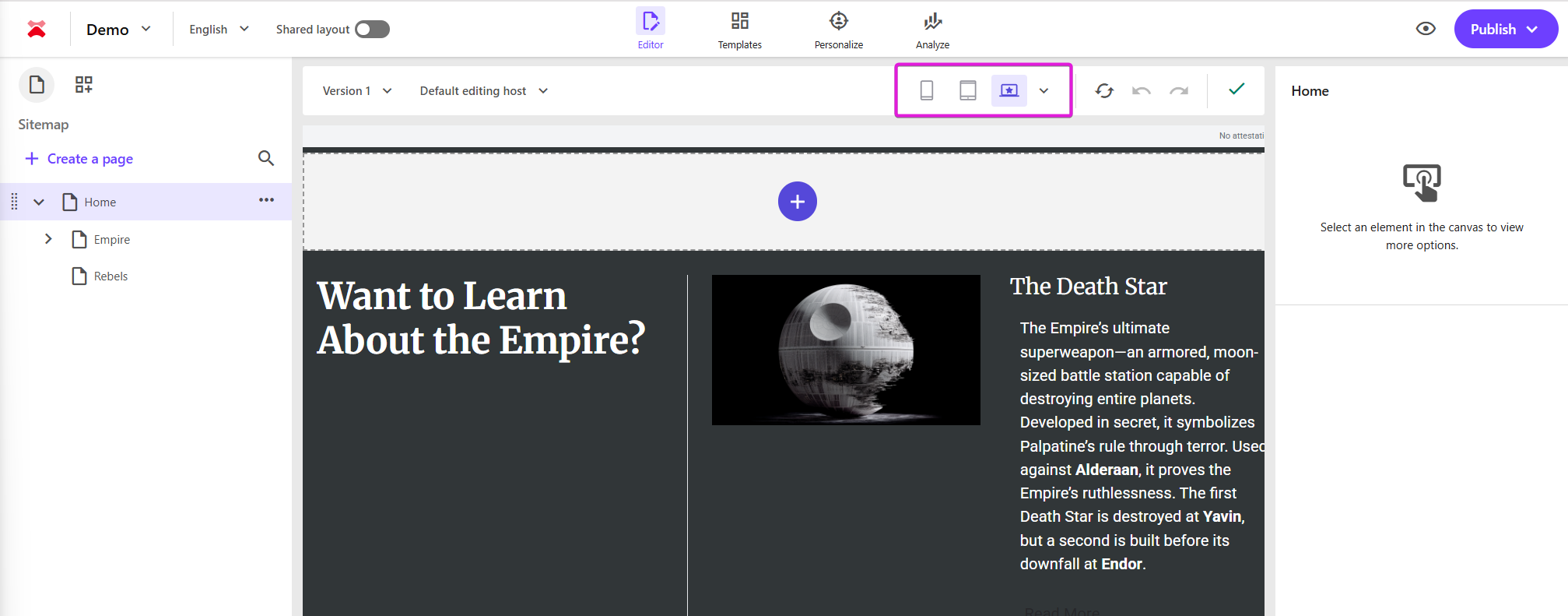
In Sitecore XM Cloud Pages, you can find the Device Layouts at the top of the interface, just above where you will see the rendering of your site. By default, the Device Layout used every time you visit pages is Desktop Small. Now, this may or may not be the best choice for you or your authors. Maybe they have larger screens for which to author on, or smaller for that matter. Maybe the breakpoints used don’t match that with the design and your implementation.
If you’re like me, you might even be in the habit of accidentally refreshing the page, instead of reloading the canvas (using the button next to the device layout). By refreshing the page, it reverts your selection back to the default which can be somewhat frustrating.
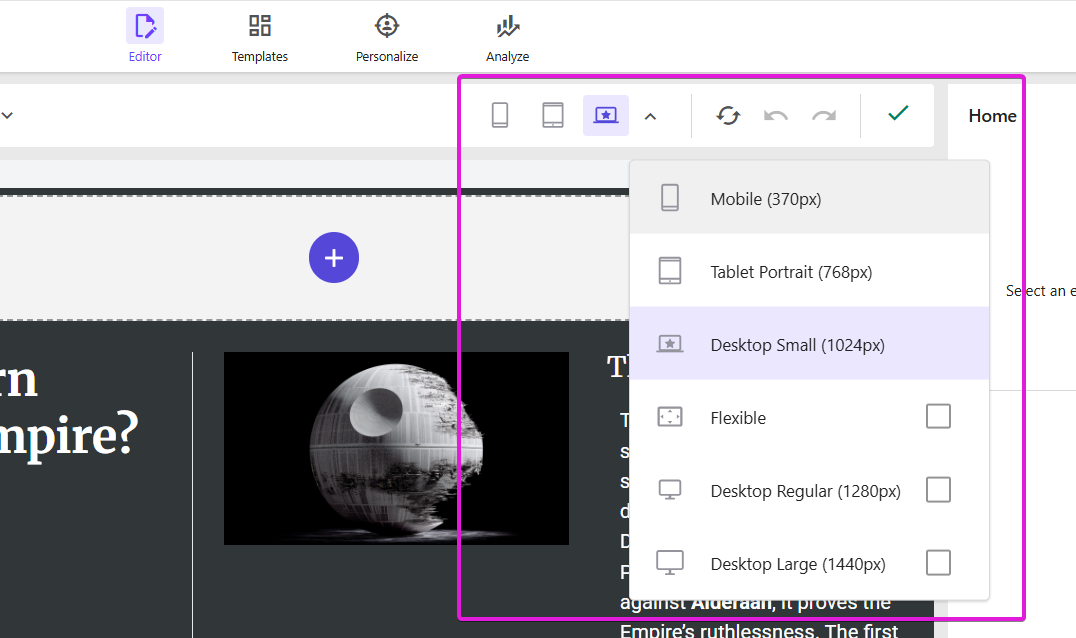
In Pages, there is a dropdown menu with all possible device layout options available to you. But are they all the options? Turns out there are more. By default all you have are:
Mobile
Tablet Portrait
Desktop Small
Flexible
Desktop Regular
Desktop Large
So can you set a new default? At first glance looking around the Pages interface, it doesn’t immediately seem like you can. But, you can indeed. It’s just not in the most obvious of places. It is though in a place that once you set it up, should be serialized into your project such that it gets applied to every environment.
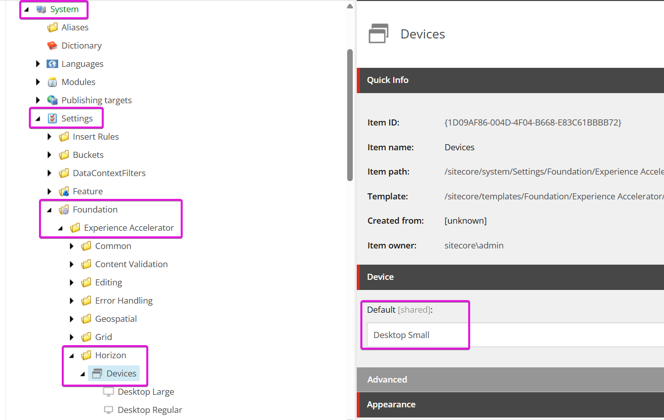
Locating the Device Layout Selection in Content Editor
Opening up Content Editor, you can navigate down to System > Settings > Foundation > Experience Accelerator > Horizon > Devices. Here you’ll find an option to select the Default layout choice for all users of Pages in your organization and this particular environment.
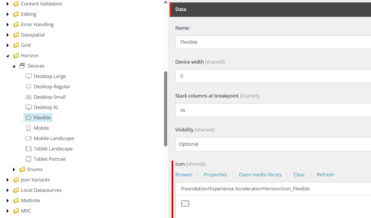
Keep in mind, even if an option shown in the list is technically “Disabled”, you can still select it. From here, you’ll want to open up Devices and navigate to the particular option you wish. For our example, I want to make Flexible, my default option so we’ll select that as our Default. Next, we’ll open up Flexible to see what options we have.
You can see here we can modify a good number of attributes. Everything from the name, to the device width even the icon it uses. By having it set to 0, it stipulates that there is no device width and hence it will fill all available width. All options are shown here:
Name
Device width - must be a number
Stack columns at breakpoint
Visibility - Options are Disabled, Fixed, Optional
Icon
If we want our icon choices to be on the bar, without having to select the dropdown menu to see them, we need to set the Visibility to Fixed. You’ll notice that the Desktop XL device layout is presently set to Disabled.
Why Is it Important to Update Your Device Layout Setting?
There are a few good reasons as to why this is not a step to avoid doing. Whether it’s right out the gate at the start of your project, or it’s part of the final touches you put on the delivery.
Show Off Your Front-End as Intended
It's possible that the default device layouts don't correspond with your responsive breakpoints or CSS media queries. Keeping them updated guarantees that the Experience Editor preview will function similarly to your actual website.
Enhance the Author Experience
These previews are used by content creators to confirm how their work appears on various devices. Precise breakpoints aid in preventing manufacturing surprises.
Establish A Standard for Authoring
Establishing a standard set of device options (such as desktop, tablet, and mobile) helps enforce a design framework and prevents confusion caused by authors selecting settings at random.
Assure Better Testing
To promote team alignment, QA and UAT users can preview the site using the same breakpoints that developers and designers utilize. It also means that when they go into production, all their settings are there and ready for them. There’s no additional changes that need to be done.