Reading time: 11 min read
Getting Started with Sitecore Content SDK, Next.js App Router & shadcn/ui
Building the Next-Gen Sitecore Frontend: Content SDK + App Router + shadcn/ui
Start typing to search...
The Sitecore Content SDK is the next evolution of Sitecore's headless development toolkit, succeeding JSS (JavaScript Services). It's designed from the ground up for modern React patterns, TypeScript-first development, and seamless integration with Sitecore XM Cloud.
Beta Notice : The Next.js App Router template nextjs-app-router is currently in beta . While production-ready for most use cases, some features may evolve. The Pages Router template remains the stable option for production deployments.
In this tutorial, we'll set up a complete Sitecore XM Cloud frontend with:
By the end, you'll understand the complete request flow from browser to rendered component, and have reusable patterns for building your own components.
Run the CLI to scaffold a new project:
npx create-content-sdk-app@latest
You’ll see the Content SDK ASCII logo and be prompted with options:

Content SDK CLI
nextjs-app-router (beta) for the latest Next.js featuresSSR for server-side rendering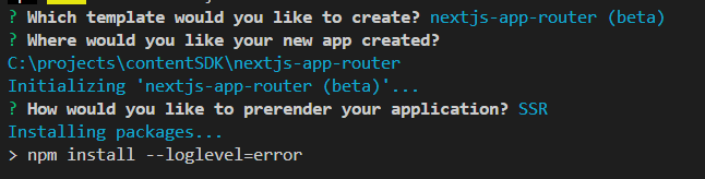
Template Selection
The CLI will install all dependencies automatically.
Once complete, you’ll see confirmation:
Installation Complete
Get your credentials from XM Cloud Deploy Portal → Developer settings:
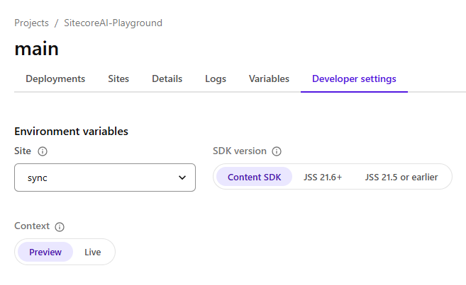
XM Cloud Developer Settings
Create .env.local in your project root:
    # Edge API Configuration
SITECORE_EDGE_CONTEXT_ID=your-context-id
NEXT_PUBLIC_SITECORE_EDGE_CONTEXT_ID=your-context-id
# Site Configuration
NEXT_PUBLIC_DEFAULT_SITE_NAME=your-site-name
NEXT_PUBLIC_DEFAULT_LANGUAGE=en
# Editing Secret (for Pages Editor)
SITECORE_EDITING_SECRET=your-secret
Initialize shadcn in your project:
    cd nextjs-app-router
npx shadcn@latest init
Select your preferences:
New YorkNeutralYes Add components as needed:
npx shadcn@latest add button carousel
By default, the Sitecore CLI scans src/components and registers everything as Sitecore components. To prevent shadcn UI components from being registered, update sitecore.cli.config.ts :
    export default defineCliConfig({
  // ... other config
  componentMap: {
    paths: ["src/components"],
    exclude: ["src/components/ui/*"], // Exclude shadcn components
  },
});
If you’re coming from the Pages Router (JSS), here are the major architectural changes:
| Aspect | Pages Router (JSS) | App Router (Content SDK) |
|---|---|---|
| Components | Client-side by default | Server Components by default |
| Data Fetching | getStaticProps / getServerSideProps | Direct async/await in components |
| Routing | pages/[[...path]].tsx | app/[site]/[locale]/[[...path]]/page.tsx |
| Layout | _app.tsx + _document.tsx | Nested layout.tsx files |
| Middleware | Optional | Required for multisite/i18n |
| Context | SitecoreContext HOC | SitecoreProvider + Providers wrapper |
The root layout wraps your entire application:
    import "./globals.css";
export default function RootLayout({
  children,
}: {
  children: React.ReactNode;
}) {
  return (
    <html lang="en">
      <body>{children}</body>
    </html>
  );
}
This is where global styles are imported. Unlike Pages Router’s _document.tsx , you have full control over the HTML structure.
The middleware runs on every request before the page renders. It handles:
    import {
  defineMiddleware,
  AppRouterMultisiteMiddleware,
  PersonalizeMiddleware,
  RedirectsMiddleware,
  LocaleMiddleware,
} from "@sitecore-content-sdk/nextjs/middleware";
export function middleware(req: NextRequest, ev: NextFetchEvent) {
  return defineMiddleware(locale, multisite, redirects, personalize).exec(
    req,
    ev
  );
}
Middleware Chain:
| Middleware | Purpose |
|---|---|
LocaleMiddleware | Detects and sets user language |
AppRouterMultisiteMiddleware | Resolves which site to serve |
RedirectsMiddleware | Handles Sitecore redirects |
PersonalizeMiddleware | CDP personalization rules |
The middleware rewrites the URL internally to include [site] and [locale] segments, enabling the dynamic routing.
The Providers component wraps your app with necessary contexts:
    "use client";
import {
  ComponentPropsContext,
  SitecoreProvider,
} from "@sitecore-content-sdk/nextjs";
export default function Providers({ children, page, componentProps }) {
  return (
    <SitecoreProvider api={scConfig.api} componentMap={components} page={page}>
      <ComponentPropsContext value={componentProps}>
        {children}
      </ComponentPropsContext>
    </SitecoreProvider>
  );
}
Key Points:
'use client' because it uses React ContextSitecoreProvider makes page data available to all componentsComponentPropsContext provides pre-fetched component datacomponent-map.client.ts for client-side component resolutionThe heart of your application handles all Sitecore routes:
    export default async function Page({ params, searchParams }: PageProps) {
  const { site, locale, path } = await params;
  const draft = await draftMode();
  // Set locale for internationalization
  setRequestLocale(`${site}_${locale}`);
  // Fetch page data from Sitecore
  let page;
  if (draft.isEnabled) {
    // Preview/editing mode - fetch draft content
    const editingParams = await searchParams;
    page = await client.getPreview(editingParams);
  } else {
    // Published content - fetch from Edge
    page = await client.getPage(path ?? [], { site, locale });
  }
  if (!page) {
    notFound();
  }
  // Fetch component-specific data
  const componentProps = await client.getComponentData(
    page.layout,
    {},
    components
  );
  return (
    <NextIntlClientProvider>
      <Providers page={page} componentProps={componentProps}>
        <Layout page={page} />
      </Providers>
    </NextIntlClientProvider>
  );
}
Route Segments Explained:
| Segment | Example | Purpose |
|---|---|---|
[site] | mysite | Multi-site support |
[locale] | en | Language/region |
[[...path]] | products/headphones | Catch-all for Sitecore routes |
Data Flow:
page.tsx fetches layout data from Sitecore Edge APILayout component renders placeholders with AppPlaceholder The Layout component renders Sitecore placeholders:
    import { AppPlaceholder, Page } from "@sitecore-content-sdk/nextjs";
import componentMap from ".sitecore/component-map";
const Layout = ({ page }: LayoutProps) => {
  const { layout } = page;
  const { route } = layout.sitecore;
  return (
    <>
      <header>
        <AppPlaceholder
          page={page}
          componentMap={componentMap}
          name="headless-header"
          rendering={route}
        />
      </header>
      <main>
        <AppPlaceholder
          page={page}
          componentMap={componentMap}
          name="headless-main"
          rendering={route}
        />
      </main>
      <footer>
        <AppPlaceholder
          page={page}
          componentMap={componentMap}
          name="headless-footer"
          rendering={route}
        />
      </footer>
    </>
  );
};
How Placeholders Work:
AppPlaceholder reads the rendering data from Sitecoreheadless-main )componentMapfields and params propsCustom 404 pages are content-managed in Sitecore:
    export default async function NotFound() {
  const headersList = await headers();
  const { site, locale } = parseRewriteHeader(headersList);
  // Fetch custom 404 page from Sitecore
  const page = await client.getErrorPage(ErrorPage.NotFound, {
    site: site || scConfig.defaultSite,
    locale: locale || scConfig.defaultLanguage,
  });
  if (page) {
    // Render Sitecore-managed 404 page
    return (
      <NextIntlClientProvider>
        <Providers page={page}>
          <Layout page={page} />
        </Providers>
      </NextIntlClientProvider>
    );
  }
  // Fallback if no custom 404 configured
  return (
    <div>
      <h1>Page not found</h1>
      <Link href="/">Go to the Home page</Link>
    </div>
  );
}
This allows content authors to design custom 404 pages in XM Cloud with full component support.
In this section, we’ll look at two components:
HeroST as a Server Component (no "use client" ), ideal for mostly-static content.TextSlider as a Client Component , since it uses interactivity, Embla plugins, and hooks.A split-screen hero with 60/40 layout, supporting rendering variants:
    import {
  Text,
  Image as SitecoreImage,
  Link as SitecoreLink,
  Field,
  ImageField,
  LinkField,
} from "@sitecore-content-sdk/nextjs";
import { Button } from "@/components/ui/button";
import { cn } from "@/lib/utils";
interface HeroSTFields {
  Eyebrow?: Field<string>;
  Title?: Field<string>;
  Link1?: LinkField;
  Link2?: LinkField;
  Image1?: ImageField;
  Image2?: ImageField;
}
interface HeroSTProps {
  params?: { FieldNames?: string; [key: string]: string | undefined };
  fields?: HeroSTFields;
}
export default function HeroST({ fields, params }: HeroSTProps) {
  if (!fields) {
    return (
      <section className="min-h-screen bg-neutral-100">No content</section>
    );
  }
  // Handle rendering variant from XM Cloud
  const isRightVariant = params?.FieldNames === "Right";
  const ContentPanel = () => (
    <div className="relative w-full lg:w-[60%] flex items-center min-h-screen">
      {/* Background with blur effect */}
      {fields.Image2?.value?.src && (
        <div className="absolute inset-0 z-0">
          <SitecoreImage
            field={fields.Image2}
            className="w-full h-full object-cover"
          />
          <div className="absolute inset-0 backdrop-blur-2xl bg-white/30" />
        </div>
      )}
      <div className="relative z-10 px-8 lg:px-16 py-16 max-w-2xl">
        {fields.Eyebrow?.value && (
          <Text
            field={fields.Eyebrow}
            tag="span"
            className="text-lg font-bold uppercase text-lime-400 mb-4"
          />
        )}
        {fields.Title?.value && (
          <Text
            field={fields.Title}
            tag="h1"
            className={cn(
              "text-5xl lg:text-8xl font-black uppercase tracking-tighter",
              "text-neutral-900 leading-[0.85] mb-10"
            )}
          />
        )}
        <div className="flex gap-4">
          {fields.Link1?.value?.href && (
            <SitecoreLink field={fields.Link1}>
              <Button
                size="lg"
                className="rounded-full bg-lime-400 text-neutral-900 hover:bg-lime-300"
              >
                {fields.Link1.value.text || "Learn more"}
              </Button>
            </SitecoreLink>
          )}
          {fields.Link2?.value?.href && (
            <SitecoreLink field={fields.Link2}>
              <Button variant="outline" size="lg" className="rounded-full">
                {fields.Link2.value.text || "Buy"}
              </Button>
            </SitecoreLink>
          )}
        </div>
      </div>
    </div>
  );
  const ImagePanel = () => (
    <div className="relative w-full lg:w-[40%] min-h-screen">
      {fields.Image1?.value?.src ? (
        <SitecoreImage
          field={fields.Image1}
          className="absolute inset-0 w-full h-full object-cover"
        />
      ) : (
        <div className="w-full h-full bg-gradient-to-br from-sky-400 to-sky-200" />
      )}
    </div>
  );
  return (
    <section className="relative min-h-screen w-full bg-neutral-50 overflow-hidden">
      <div className="flex flex-col lg:flex-row min-h-screen">
        {isRightVariant ? (
          <>
            <ImagePanel />
            <ContentPanel />
          </>
        ) : (
          <>
            <ContentPanel />
            <ImagePanel />
          </>
        )}
      </div>
    </section>
  );
}

HeroST component rendered using the default (Left) variant — 60/40 split layout with blurred background and shadcn UI buttons.
The HeroST component demonstrates several strong patterns that align well with how Sitecore developers think and build:
Rendering variant handling using params.FieldNames === "defualt" is clean and intuitive.
This mirrors how SXA and XM Cloud implement variants, so it will feel natural to Sitecore teams.
Image2 plus a translucent overlay adds visual depth without complicating the markup.Use of cn and shadcn’s Button makes the styling modern, clean, and maintainable.
This also shows how easily shadcn can be mixed with Sitecore-delivered field data.
Overall, this is an excellent example of a Server Component that stays purely presentational while still supporting flexible authoring through Sitecore.
Animated text carousel using shadcn’s Carousel with Embla:
    "use client";
import { Text, Field } from "@sitecore-content-sdk/nextjs";
import {
  Carousel,
  CarouselContent,
  CarouselItem,
} from "@/components/ui/carousel";
import { cn } from "@/lib/utils";
import Autoplay from "embla-carousel-autoplay";
import { useRef } from "react";
interface TextSliderFields {
  Text?: Field<string>;
}
interface TextSliderProps {
  params?: { FieldNames?: string; [key: string]: string | undefined };
  fields?: TextSliderFields;
}
export default function TextSlider({ fields }: TextSliderProps) {
  const plugin = useRef(Autoplay({ delay: 3000, stopOnInteraction: false }));
  if (!fields) {
    return <section className="py-16 bg-neutral-900">No content</section>;
  }
  const textValue = fields.Text?.value || "";
  // Repeat text for continuous scroll effect
  const slides = [textValue, textValue, textValue, textValue];
  return (
    <section className="relative py-12 md:py-16 bg-neutral-950 overflow-hidden">
      {/* Fade edges */}
      <div className="absolute left-0 top-0 bottom-0 w-32 bg-gradient-to-r from-neutral-950 to-transparent z-10" />
      <div className="absolute right-0 top-0 bottom-0 w-32 bg-gradient-to-l from-neutral-950 to-transparent z-10" />
      <Carousel
        opts={{ align: "start", loop: true, dragFree: true }}
        plugins={[plugin.current]}
        className="w-full"
      >
        <CarouselContent className="-ml-8">
          {slides.map((slide, index) => (
            <CarouselItem key={index} className="pl-8 basis-auto">
              <div className="flex items-center gap-8">
                <span
                  className={cn(
                    "text-5xl md:text-7xl lg:text-9xl",
                    "font-black uppercase tracking-tighter",
                    "text-transparent bg-clip-text",
                    "bg-gradient-to-r from-amber-400 via-orange-500 to-red-500",
                    "whitespace-nowrap select-none"
                  )}
                >
                  {slide}
                </span>
                <span className="w-4 h-4 rounded-full bg-amber-500/50" />
              </div>
            </CarouselItem>
          ))}
        </CarouselContent>
      </Carousel>
      {/* Static text below */}
      <div className="mt-8 text-center">
        <Text
          field={fields.Text}
          tag="p"
          className="text-xl text-neutral-500 uppercase"
        />
      </div>
    </section>
  );
}

TextSlider component using shadcn Carousel with Embla autoplay
The TextSlider component shows how interactive UI elements fit naturally into the App Router ecosystem:
Because it uses Embla plugins, hooks, and animation, marking it with "use client" is the right choice.
It keeps the interactive logic on the client while still allowing Sitecore to provide content fields.
Carousel integration is smooth and minimal. You only import what you need without bloating the bundle.bg-clip-text provides a polished visual style while still being fully CMS-driven.Overall, this is an excellent example of how to build interactive, CMS-driven components in a composable App Router setup.
npm run dev
Visit http://localhost:3000 to see your site powered by Sitecore XM Cloud!
    Browser Request
      ↓
┌─────────────────────────────────────────┐
│  Middleware                             │
│  - LocaleMiddleware (detect language)   │
│  - MultisiteMiddleware (resolve site)   │
│  - RedirectsMiddleware                  │
│  - PersonalizeMiddleware                │
└─────────────────────────────────────────┘
      ↓
┌─────────────────────────────────────────┐
│  page.tsx                               │
│  - Fetch layout from Sitecore Edge      │
│  - Get component props                  │
│  - Wrap with Providers                  │
└─────────────────────────────────────────┘
      ↓
┌─────────────────────────────────────────┐
│  Layout.tsx                             │
│  - Render AppPlaceholder (header)       │
│  - Render AppPlaceholder (main)         │
│  - Render AppPlaceholder (footer)       │
└─────────────────────────────────────────┘
      ↓
┌─────────────────────────────────────────┐
│  Components (HeroST, TextSlider, etc.)  │
│  - Receive fields + params from Sitecore│
│  - Render with shadcn/ui components     │
└─────────────────────────────────────────┘
As we wrap up this guide, it’s clear that the Content SDK and App Router fundamentally reshape how modern Sitecore frontends are built.
The Content SDK isn’t just the next step after JSS—it’s Sitecore aligning with today’s frontend ecosystem. Server Components, TypeScript-first patterns, and the App Router aren’t workarounds or compromises; they form a new foundation for building scalable, composable, cloud-native experiences.
What makes this approach especially powerful is its flexibility. Sitecore handles the content, editing, and delivery workflows, while you choose the UI patterns, styling systems, and component libraries—Tailwind, shadcn, anything you prefer. The SDK stays minimal, staying out of your way while giving you everything you need.
Start small: get one component rendering, understand the flow from middleware to placeholder, and the architecture naturally scales with you.
The future of Sitecore development is composable, fast, and developer-friendly—and this stack shows exactly how to build it.
params.FieldNames .Ready to explore further? Try the Content SDK + App Router stack in your next XM Cloud project and experience how effortless modern Sitecore development can be.