Reading time: 20 min read
Exploring Sitecore’s Blok Design System
Go from zero to loaded with components in seconds.
Start typing to search...
In this day and age, time is an extremely valuable resource. It can always feel like there is a greater and greater urgency to get a site, or even component, out the door and into the hands of a valued client. Some of that time can involve a developer getting up to speed on a client's product or service which is critical to being able to deliver value quickly. This is where design systems come in.
Here's the problem: without a design system, every project starts from scratch. Designers create similar buttons. Developers rebuild the same form across different projects. Colors don't match. Typography scales inconsistently. Padding! Don’t get me started on the issues of padding. Accessibility gets handled differently everywhere. What’s the result? Well, you end up with user experiences that don’t feel connected and a lot wasted effort. This results in bugs that you end up having to revisit later on. And perhaps a project manager displeased with the pace. Let alone the frustration, stress, and lack of confidence that comes with it.
A design system can help relieve that stress and frustration. Think of it as your single source of truth. A design system can be a shared library of standards, guidelines, and tools that everyone on the team uses. You get visual foundations (colors, typography, spacing), functional components (buttons, forms, navigation), and clear principles for how to use them. When done right, a button looks and behaves identically across every application. Color choices meet accessibility standards automatically. Designers and developers work from the same playbook.
Companies like Google (Material Design), Microsoft (Fluent), and IBM (Carbon) have proven this works. Their design systems let teams ship faster, maintain consistency, and their developers spend less time reinventing basic interface patterns and more time on new features.
Pair this with something like Storybook and your golden. At least in my opinion when it comes to delivering end results to clients.
Sitecore built Blok to solve exactly these problems for their ecosystem. It's their official design system. It’s a UI framework and style guide for building applications that work with Sitecore products and services because they use it as such. The general availability (GA) version takes a fresh approach, using modern tooling (Shadcn and Tailwind CSS) to make development faster while keeping everything visually consistent across all Sitecore products.
This is enormously valuable for partners and clients alike. Especially with SitecoreAI's new Marketplace. If you’re going to be building apps for your own purpose, your clients or looking to put on the Marketplace for others, getting that design to blend seamlessly is going to win your audience over.
What makes the Blok Design System better than other versions or even the previous Blok design system? Component ownership. Instead of installing packages from NPM that you can't touch, Blok components get installed directly into your codebase. Makes it super handy when you want to customize them. You can extend them however you need.
So what’s under the hood? Specifically, in terms of the newly released version, we have the following:
The general availability release of Blok represents a significant evolution in Sitecore's design system approach:
Shadcn is a component system that gives you flexibility and control of your components. Instead of installing packages, components are copied directly into your project. It’s handy because it you full control to customize them as needed. Obviously this has both pros and cons of course. It enables you, once setup, to just run with it and not have to worry about updating components or dealing with version conflicts. You can then evolve your design system as you go, and not have to worry about updating components or dealing with version conflicts.
Key benefits:
node_modulesLeveraging Tailwind CSS's utility-first methodology provides:
Blok provides a centralized component registry making it easy to:
Core design elements include:
So now you know a bit about Sitecore’s Blok, how about let’s set it up? It’ll just take a minute. The Shadcn CLI handles most of the configuration automatically.
Once you’ve got your Sitecore AI foundation environment setup, you can proceed with getting Blok ready to go.
Run the Shadcn initialization command in your project's root folder:
npx shadcn@latest init
During initialization, you'll be prompted to choose a base color. The CLI will then automatically:
components.json configuration filesrc/lib/utils.ts with utility functionsWhat happens during initialization:
You have two options for installing components:
Option A: Install Individual Components
Install specific components as you need them. For example, here’s how we could install the Button component:
npx shadcn@latest add https://blok.sitecore.com/r/button.json
This approach keeps your project lean by only including components you actually use.
Option B: Install All Blok Components (Recommended for most projects)
Install the complete Blok component registry to get access to all available components:
npx shadcn@latest add <https://blok.sitecore.com/r/blok-components.json>
This command will install a comprehensive set of components including:
The following example looks at how you can verify a component has been installed correctly, but you would most likely use Storybook to get this organized and validated. I highly, highly recommend using Storybook to capture, monitor and demonstrate design choices as it makes managing changes very easy and can allow a client to see how a decision can impact more than they might think.
Blok Components Used:
Button - Demonstrates multiple variantsUpdate your src/App.tsx to test the installation. Components are imported with the @/ alias:
import { Button } from "@/components/ui/button";
export default function MyComponent() {
  return (
    <div className="p-8 space-x-4">
      <Button variant="default">Primary</Button>
      <Button variant="outline">Outline</Button>
      <Button variant="ghost">Ghost</Button>
      <Button variant="link">Link</Button>
    </div>
  );
}
Understanding the @/ alias: The @/ alias points to your src directory, making imports cleaner and more maintainable. Instead of ../../components/ui/button, you write @/components/ui/button.
After installation, your project will have the following structure:
your-project/
├── src/
│   ├── components/
│   │   └── ui/           # Blok components live here
│   │       ├── button.tsx
│   │       ├── card.tsx
│   │       ├── input.tsx
│   │       └── ...
│   ├── lib/
│   │   └── utils.ts      # Utility functions (cn helper, etc.)
│   ├── App.tsx
│   └── index.css         # CSS with design tokens
├── components.json       # Shadcn configuration
├── tailwind.config.js    # Tailwind configuration
└── package.json
For more detailed setup instructions and troubleshooting, visit the Blok documentation.
Blok offers an extensive collection of production-ready React UI components built on Shadcn and Tailwind CSS. These components are designed to accelerate development while ensuring consistency and accessibility.
The foundation of any interface, these components cover common UI needs:
Example: Button Component
Blok Components Used:
Button - With variants: default, outline, ghost, destructiveimport { Button } from "@/components/ui/button";
// Multiple variants available
<Button variant="default">Primary Action</Button>
<Button variant="outline">Secondary Action</Button>
<Button variant="ghost">Tertiary Action</Button>
<Button variant="destructive">Delete</Button>
Comprehensive form controls with built-in validation and accessibility:
Example: Form Component
Blok Components Used:
Input - For text inputLabel - For accessible form labelsButton - For form submissionimport { Input } from "@/components/ui/input";
import { Label } from "@/components/ui/label";
import { Button } from "@/components/ui/button";
export function ContactForm() {
return (
<form className="space-y-4">
<div>
<Label htmlFor="email">Email</Label>
<Input type="email" id="email" placeholder="Enter your email" />
</div>
<Button type="submit">Submit</Button>
</form>
);
}
Help users navigate through your application:
Communicate status and information to users:
Present information in structured and organized ways that are more easily accessible to readers and authors alike. Such as:
Complex components for sophisticated interfaces. Some of these we’re likely to see more broadly in tools like Pages which have to deal with various field types.
Each component comes with multiple variants to fit different use cases. Variants are, in Sitecore, a great and easy way for a client to switch a components style from one way to another. Think of them as “pre-made” styles. No need to adjust padding, colors, etc. Although there’s nothing stopping you from doing that. They can switch them simply from one background and foreground color to the next. Variants are also OOTB compatible with Personalization and A/B/n testing. Adjusting styles, etc don’t have that capability.
For example, the Button component includes:
default: Primary action buttonoutline: Secondary action with borderghost: Minimal styling for tertiary actionslink: Styled as a hyperlinkdestructive: For dangerous actions (delete, remove, etc.)All Blok components are built on Radix UI primitives, ensuring:
One of Blok’s greatest strengths as I’ve mentioned, is that the component code, is stored in your own file structure. This gives you complete control to customize and extend them. The design system provides the foundation through Tailwind CSS utilities and design tokens. There’s nothing stopping you now from modifying a particular component to suit your needs. Maybe you want buttons to have a specific animation. You can do that now quite easily.
Blok components follow the Shadcn philosophy:
Blok extends Tailwind's configuration with Sitecore-specific design tokens:
Colors
Spacing
Typography
text-xs, text-sm, text-base, text-lg, text-xl, etc.font-normal, font-medium, font-semibold, font-boldBorder Radius
rounded-sm: 0.125remrounded: 0.25remrounded-md: 0.375remrounded-lg: 0.5remrounded-xl: 0.75remShadows
shadow-sm, shadow, shadow-md, shadow-lg, shadow-xlBlok Components Used:
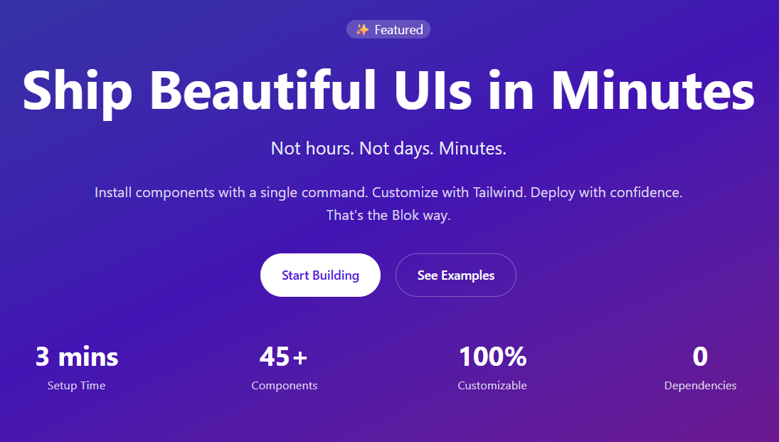
Button - For primary and secondary CTAsBadge - For eyebrow/label textHere's a real-world example of building a production-ready component for Sitecore using Blok's design system. This HeroBanner component demonstrates composition, variants, and integration with Sitecore JSS:
import { ComponentProps, HeroBannerFields } from "@/types/sitecore";
import { Text, RichText, Link, NextImage } from "@sitecore-jss/sitecore-jss-nextjs";
import { Button } from "@/components/ui/button";
import { Badge } from "@/components/ui/badge";
export function HeroBanner({ fields }: ComponentProps<HeroBannerFields>) {
  const {
    heading,
    subheading,
    description,
    eyebrow,
    primaryCTA,
    secondaryCTA,
    badge,
    variant = "default",
  } = fields;
  // Render different variants
  if (variant === "gradient") {
    return <HeroBannerGradient fields={fields} />;
  }
  // Default variant
  return (
    <section className="relative overflow-hidden bg-gradient-to-b from-white to-neutral-50 dark:from-neutral-950 dark:to-neutral-900">
      <div className="container mx-auto px-4 py-24 lg:py-32">
        <div className="max-w-4xl mx-auto text-center">
          {/* Badge/Eyebrow */}
          {(eyebrow || badge) && (
            <div className="mb-6">
              <Badge variant="default" className="text-sm px-4 py-1">
                <Text field={eyebrow || badge} />
              </Badge>
            </div>
          )}
          {/* Heading with gradient text */}
          <Text
            tag="h1"
            field={heading}
            className="text-5xl md:text-6xl lg:text-7xl font-bold mb-6 bg-gradient-to-r from-neutral-900 via-neutral-700 to-neutral-600 dark:from-neutral-100 dark:via-neutral-300 dark:to-neutral-400 bg-clip-text text-transparent"
          />
          {/* Subheading */}
          {subheading && (
            <Text
              tag="p"
              field={subheading}
              className="text-xl md:text-2xl text-neutral-600 dark:text-neutral-400 mb-6"
            />
          )}
          {/* Description */}
          <RichText
            field={description}
            className="text-lg text-neutral-600 dark:text-neutral-400 mb-8 max-w-2xl mx-auto"
          />
          {/* CTAs */}
          {(primaryCTA || secondaryCTA) && (
            <div className="flex flex-wrap gap-4 justify-center mb-12">
              {primaryCTA && (
                <Button size="lg" asChild>
                  <Link field={primaryCTA} />
                </Button>
              )}
              {secondaryCTA && (
                <Button size="lg" variant="outline" asChild>
                  <Link field={secondaryCTA} />
                </Button>
              )}
            </div>
          )}
        </div>
      </div>
    </section>
  );
}
What this demonstrates:
<Text>, <RichText>, and <Link> components for field renderinglg:py-32, md:text-6xl)dark:from-neutral-950)tag propBlok Components Used:
Button - Customized with variant-specific stylingBadge - Semi-transparent styling for gradient backgroundBuilding on the HeroBanner, let's look at how to create variant layouts. Here's the gradient variant:
import { Text, RichText, Link } from "@sitecore-jss/sitecore-jss-nextjs";
// Gradient variant with full-width colored background
function HeroBannerGradient({ fields }: ComponentProps<HeroBannerFields>) {
  const {
    heading,
    subheading,
    description,
    primaryCTA,
    secondaryCTA,
    badge,
    stats,
  } = fields;
  return (
    <section className="relative overflow-hidden bg-gradient-to-br from-blue-600 via-purple-600 to-pink-600">
      {/* Overlay for better text contrast */}
      <div className="absolute inset-0 bg-black/20" />
      <div className="relative container mx-auto px-4 py-24 lg:py-32">
        <div className="max-w-4xl mx-auto text-center text-white">
          {badge && (
            <Badge className="mb-6 bg-white/20 text-white border-white/30">
              <Text field={badge} />
            </Badge>
          )}
          <Text
            tag="h1"
            field={heading}
            className="text-5xl md:text-6xl lg:text-7xl font-bold mb-6"
          />
          {subheading && (
            <Text
              tag="p"
              field={subheading}
              className="text-xl md:text-2xl text-white/90 mb-6"
            />
          )}
          <RichText
            field={description}
            className="text-lg text-white/80 mb-8 max-w-2xl mx-auto"
          />
          {/* Custom styled buttons for gradient background */}
          {(primaryCTA || secondaryCTA) && (
            <div className="flex flex-wrap gap-4 justify-center">
              {primaryCTA && (
                <Button
                  size="lg"
                  className="bg-white text-purple-600 hover:bg-neutral-100"
                  asChild
                >
                  <Link field={primaryCTA} />
                </Button>
              )}
              {secondaryCTA && (
                <Button
                  size="lg"
                  variant="outline"
                  className="border-white/30 text-white hover:bg-white/10"
                  asChild
                >
                  <Link field={secondaryCTA} />
                </Button>
              )}
            </div>
          )}
        </div>
      </div>
    </section>
  );
}
Best practices:
Field, ImageField, LinkField from @sitecore-jss/sitecore-jss-nextjsField<string> for text and rich text fieldsLinkField and ImageField for complex fields? for fields that might not be populated in SitecoreComponentProps<T> wrapper for consistency across componentsYou’ve likely seen it being used more and more, but the cn() is invaluable for keeping your code and styling clean. So why use cn()?
Example usage:
<div
  className={cn(
    "px-4 py-2 rounded-md", // base styles
    isActive && "bg-primary text-white", // conditional
    className // allow prop override
  )}
/>
Component Composition: Build complex components by composing Sitecore JSS and Blok components
 // Good: Compose JSS field components with Blok UI components
 <section className="py-24">
   <Badge variant="default" className="mb-6">
     <Text field={badge} />
   </Badge>
   <Text tag="h1" field={heading} className="text-5xl font-bold mb-6" />
   <Button size="lg" asChild>
     <Link field={primaryCTA} />
   </Button>
 </section>
 // Avoid: Accessing field values directly
 <h1 className="text-5xl">{heading.value}</h1>
 <a href={primaryCTA.href}>{primaryCTA.text}</a>
Use Design Tokens: Reference theme colors, not arbitrary values
 // Good: Use theme colors
 <div className="text-primary bg-secondary">
 // Avoid: Arbitrary colors
 <div className="text-[#0066cc] bg-[#f5f5f5]">
Responsive Design: Mobile-first approach
<div className="text-sm md:text-base lg:text-lg">
Dark Mode Support: Use theme-aware classes
<div className="bg-white dark:bg-slate-900">
Accessibility: Include proper ARIA labels and keyboard navigation
 <Button aria-label="Close dialog" onClick={onClose}>
   <X className="h-4 w-4" />
 </Button>
Since components live in your codebase, you can directly modify them:
src/components/ui/button.tsxExample: Adding a new button variant
Blok Component Being Customized:
Button - Adding a custom "success" variant// src/components/ui/button.tsx
const buttonVariants = cva("inline-flex items-center justify-center...", {
variants: {
variant: {
default: "bg-primary text-primary-foreground...",
outline: "border border-input...",
// Add your custom variant
success: "bg-green-500 text-white hover:bg-green-600",
},
},
});
For comprehensive coding standards, visit the Blok resources, which cover:
Technical documentation is one of those things that not only gets neglected but also tough to be consistent in a way that your clients can feel confident in returning to. You need excellent typography, clear hierarchy, intuitive navigation and consistency. Components like Tabs and Accordions make complex topics scannable instead of overwhelming. Card components and CTAs can can help bring attention to important material or changes that should be understood quickly.
Why This Matters for SitecoreAI
If you use Blok for your documentation, you're automatically consistent with the broader SitecoreAI environment. It will help your clients feel like you’re in line with the ecosystem they are so reliant on. So why does this matter?
Whether you're building developer docs, API references, component libraries, or knowledge bases, using Blok means your content gets the same polish that defines the SitecoreAI experience. And that's valuable.
Blok is actively evolving based on community feedback and Sitecore's design direction:
As Blok evolves, updating your components is straightforward:
Because components live in your codebase, you have complete control over when and how to adopt changes.
Ready to try the Blok design system? You won’t regret it. Follow the above steps to get started. Here's a summarized version of what we covered.
npx shadcn@latest init in your projectnpx shadcn@latest add https://blok.sitecore.com/r/blok-components.jsonBlok Beta is actively being developed, and Sitecore wants to hear from you. Be active in the community by sharing what works (and what doesn't) via the community Slack. Follow that up and share your challenges or issues via support tickets. The more active we are the better the system can be. It’s why Sitecore has put it out there.
This article covers the Blok design system as of December 2025. Features and capabilities may evolve as the system continues development. Always refer to the official Blok design system documentation at blok.sitecore.com for the most up-to-date information.