Reading time: 6 min read
Turning the Sitecore OOTB Column Splitter Compatible for Tailwind in an XM Cloud Project
Learn how to use OOTB Grid Components compatible for Tailwind CSS powered projects.
Start typing to search...
Learn how to use OOTB Grid Components compatible for Tailwind CSS powered projects.
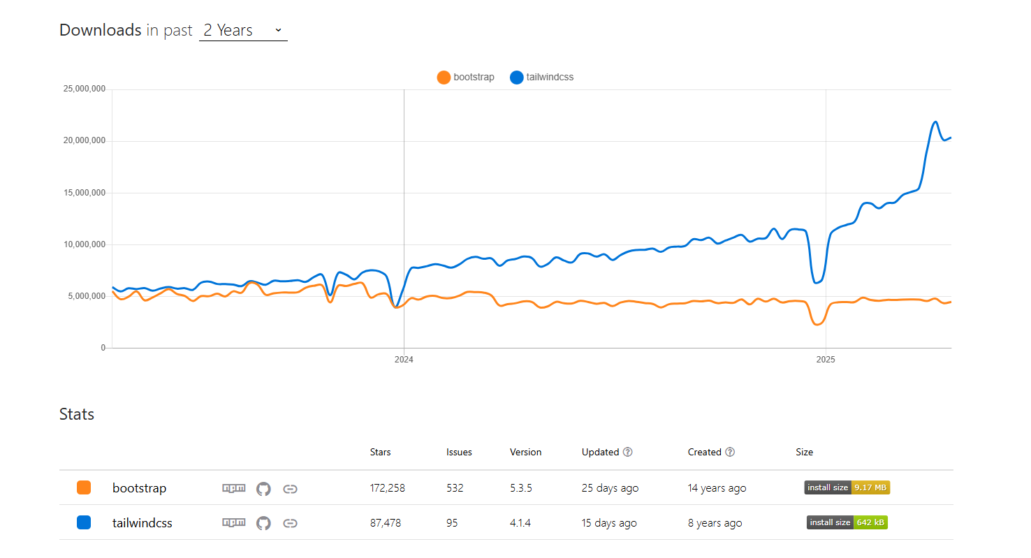
As the adoption of utility-first CSS frameworks grows, Tailwind CSS has become a standout choice, and it's been our team's preferred framework for quite some time. Its rising popularity is evident when compared to established frameworks like Bootstrap (see the trend comparison below from NPM Trends).
Our team embraced Tailwind CSS early on for its flexibility and direct control over styling. However, when working with Sitecore JSS (JavaScript Services), we encountered a common friction point: many of Sitecore's powerful out-of-the-box (OOTB) components are styled using Bootstrap by default.
This mismatch often led us to bypass these valuable Sitecore components, opting instead to build custom solutions from scratch. While this worked, it meant missing out on the efficiency and robust features Sitecore provides, particularly with its grid system components like the Column Splitter and Row Splitter.
Realizing this inefficiency, we sought a way to bridge the gap and make Sitecore's OOTB grid components work seamlessly with our preferred Tailwind CSS setup. This post details the successful approach we implemented, focusing primarily on the versatile Column Splitter.
Before diving into the solution, it's worth reiterating why integrating these components is beneficial:
Achieving harmony between Sitecore JSS grid components and Tailwind involves configuration within Sitecore itself and adjustments to your frontend codebase. Let's break it down.
The first crucial step happens within the Sitecore Content Editor.
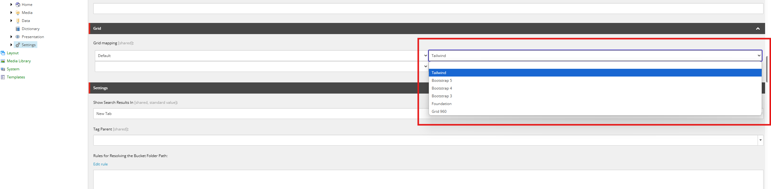
This setting tells Sitecore's Layout Service to generate Tailwind CSS utility classes instead of Bootstrap classes whenever grid-related parameters are requested for components like the Column Splitter.
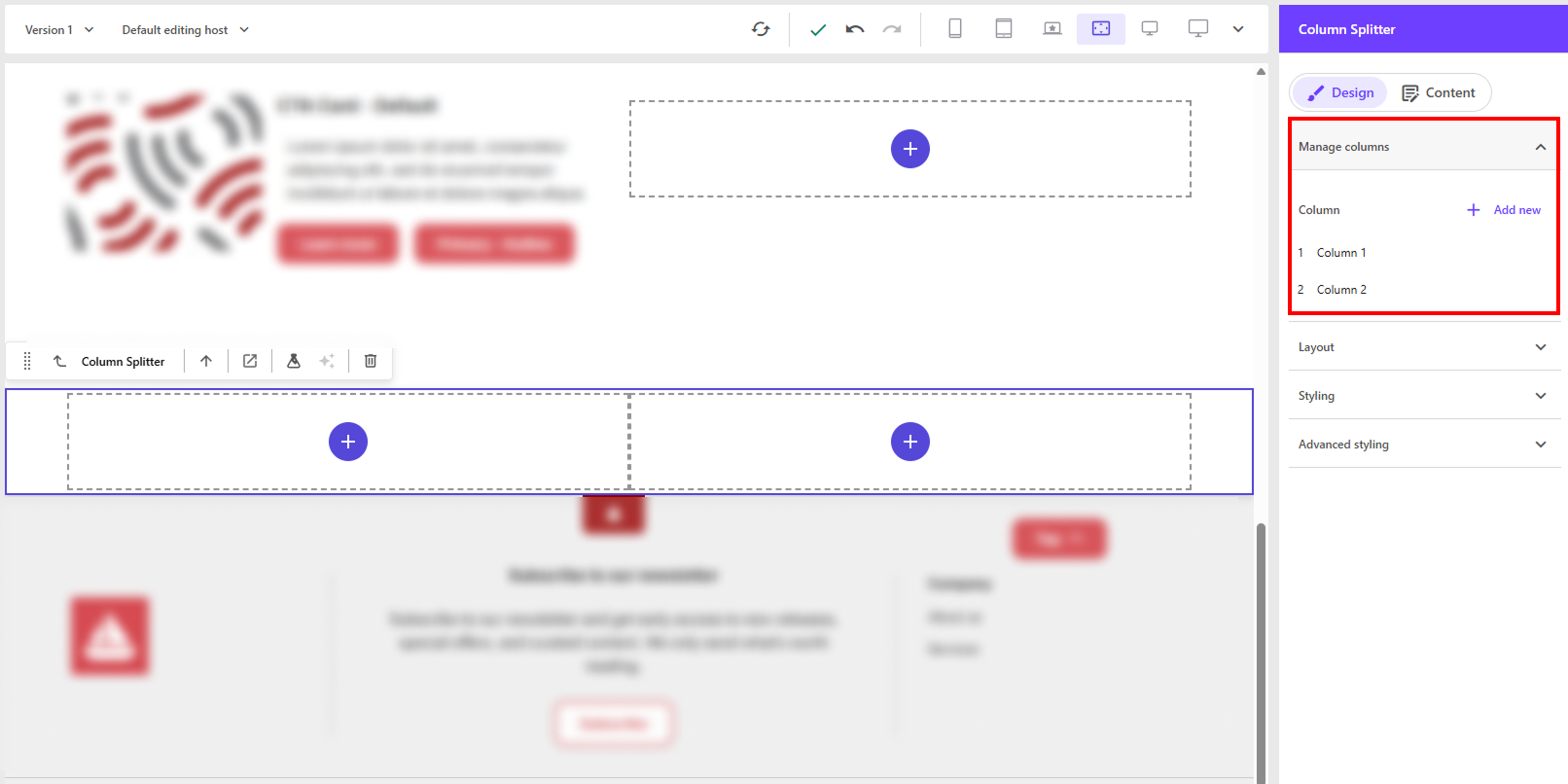
With the Sitecore setting updated, let's see how the Column Splitter component behaves in the Page builder.
Now that we've configured Sitecore and the component, let's inspect the data passed to our frontend JSS application. When you query the Layout Service for a page containing this configured Column Splitter, the params object for the component will contain Tailwind classes corresponding to your settings:
{
  "ColumnWidth1": "basis-full lg:basis-1/2",
  "ColumnWidth2": "basis-full lg:basis-1/2",
  "DynamicPlaceholderId": "19",
  "EnabledPlaceholders": "1,2",
  "FieldNames": "Default",
  "GridParameters": "basis-full",
  "SplitterSize": "2",
  "styles": "basis-full "
}
Notice the ColumnWidth parameters now contain Tailwind's flexbox basis utilities (basis-full, lg:basis-1/2). This confirms our Sitecore configuration is working correctly!
Because Sitecore generates these grid classes dynamically based on editor choices, Tailwind's build process might not see them directly in your source code. During production builds, Tailwind aggressively removes ("purges") unused CSS classes to minimize file size.
To prevent Tailwind from removing these necessary, dynamically generated grid classes, we need to add them to the safelist in your tailwind.config.js file:
  module.exports = {
    ...
    safelist: [
      // Layout and positioning utilities
      {
        pattern: /^(basis-|order-|flex|block|hidden|inline|table|static|fixed|relative|absolute)/,
        variants: ['sm', 'md', 'lg', 'xl', '2xl'],
      },
      // Margin utilities
      {
        pattern: /^m(x|l|r)-/,
        variants: ['sm', 'md', 'lg', 'xl', '2xl'],
      },
    ],
  }
The safelist ensures these classes are always included in your final CSS bundle, even if they aren't explicitly written in your component files. Be specific but inclusive enough to cover the classes Sitecore generates.
Finally, we need to update the React component code for the Column Splitter (src/components/ColumnSplitter.tsx or similar) to correctly apply these Tailwind classes.
import React from 'react';
import {
  ComponentParams,
  ComponentRendering,
  Placeholder,
} from '@sitecore-jss/sitecore-jss-nextjs';

interface ComponentProps {
  rendering: ComponentRendering & { params: ComponentParams };
  params: ComponentParams;
}

export const Default = (props: ComponentProps): JSX.Element => {
  const styles = `${props.params.GridParameters ?? ''} ${props.params.Styles ?? ''}`.trimEnd();
  const columnWidths = [
    props.params.ColumnWidth1,
    props.params.ColumnWidth2,
    props.params.ColumnWidth3,
    props.params.ColumnWidth4,
    props.params.ColumnWidth5,
    props.params.ColumnWidth6,
    props.params.ColumnWidth7,
    props.params.ColumnWidth8,
  ];
  const columnStyles = [
    props.params.Styles1,
    props.params.Styles2,
    props.params.Styles3,
    props.params.Styles4,
    props.params.Styles5,
    props.params.Styles6,
    props.params.Styles7,
    props.params.Styles8,
  ];
  const enabledPlaceholders = props.params.EnabledPlaceholders.split(',');
  const id = props.params.RenderingIdentifier;

  return (
    <div className={`row component column-splitter ${styles}`} id={id ? id : undefined}>
      {enabledPlaceholders.map((ph, index) => {
        const phKey = `column-${ph}-{*}`;
        const phStyles = `${columnWidths[+ph - 1]} ${columnStyles[+ph - 1] ?? ''}`.trimEnd();

        return (
          <div key={index} className={phStyles}>
            <div key={index} className="row">
              <Placeholder key={index} name={phKey} rendering={props.rendering} />
            </div>
          </div>
        );
      })}
    </div>
  );
};
// ... Code remains the same for these lines

export const Default: React.FC<ComponentProps> = (props): JSX.Element => {
  const tailwindClasses = `flex flex-wrap ${props.params.GridParameters ?? ''} ${props.params.Styles ?? ''}`.trim();

  // ... Code remains the same for these lines

  return (
    <div className={tailwindClasses} id={id ? id : undefined}>
      {enabledPlaceholders.map((ph, index) => {
        const phKey = `column-${ph}-{*}`;
        const phStyles = `${columnWidths[+ph - 1] || ''} ${columnStyles[+ph - 1] || ''}`.trim();

        return (
          <div key={`col-${index}`} className={phStyles}>
            <div className="w-full">
              <Placeholder key={phKey} name={phKey} rendering={props.rendering} />
            </div>
          </div>
        );
      })}
    </div>
  );
};
Sitecore JSS’s default Bootstrap styling and a Tailwind CSS preference doesn't have to lead to rebuilding components from scratch. We've shown that by configuring Sitecore's Grid System setting, updating your Tailwind safelist, and adapting the JSS Column Splitter component, you can seamlessly integrate the two. Test out other pre-built components and help reduce having to put aside any OOTB components.