Reading time: 3 min read
Sitecore SXA Content Authoring
Sitecore Experience Accelerator (SXA) offers content authors an elevated experience with an intuitive drag-and-drop WYSIWYG. Authors can also apply customized component layouts to create highly-visual pages. SXA uses grid systems that give the ability to section pages into columns and rows in varying widths.
Web Grid Systems
A grid system is a library of structured HTML/CSS components that allow webpages to be created easily. Grid systems allow content authors to create responsive sites that ensure designs are maintained across different browsers and devices.
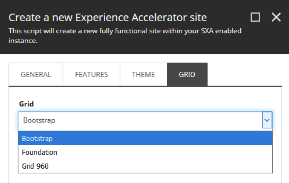
Which Grid Systems Are Available In Sitecore SXA?
When setting up a new SXA site, there are three grid options available: Bootstrap, Foundation, and Grid 360. The Bootstrap grid is applied by default if a grid isn’t selected when creating a new SXA site.
Bootstrap
Bootstrap is a responsive, mobile-first grid system with a 12-column layout that has predefined classes. Its configured to support:
- Phones
- Tablets
- Desktops
- Large Desktops
Foundation
Foundation is a responsive, mobile-first grid system with a 12-column flexible grid that can scale to any size. The default sizes are:
- Small
- Medium
- Large
Grid 960
Grid 960 is a 12-column grid system that’s based on a 960 pixels width. The default settings are:
- Size
- Prefix
- Suffix
Default Component Layouts
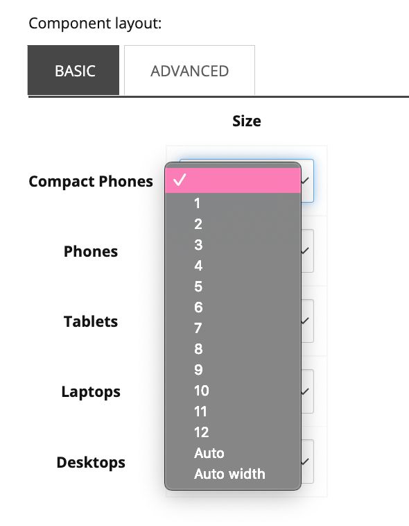
Basic Layout
The Basic component layout tab shows the different rendering options for the grid system of the enabled SXA instance. The example below shows rendering options for different devices (compact phones, phones, tablets, laptops, and desktops) using a Bootstrap grid.
In this instance, a content author can select the grid width (1-12) for a Bootstrap-configured grid.
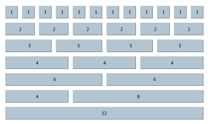
Bootstrap Brush Up
Bootstrap is the most popular CSS Framework for developing responsive and mobile-first websites. The Bootstrap grid is made up of 12 columns that are easily divided into, twelves, sixths, thirds, quarters, and halves. To learn more about Bootstrap, click here.
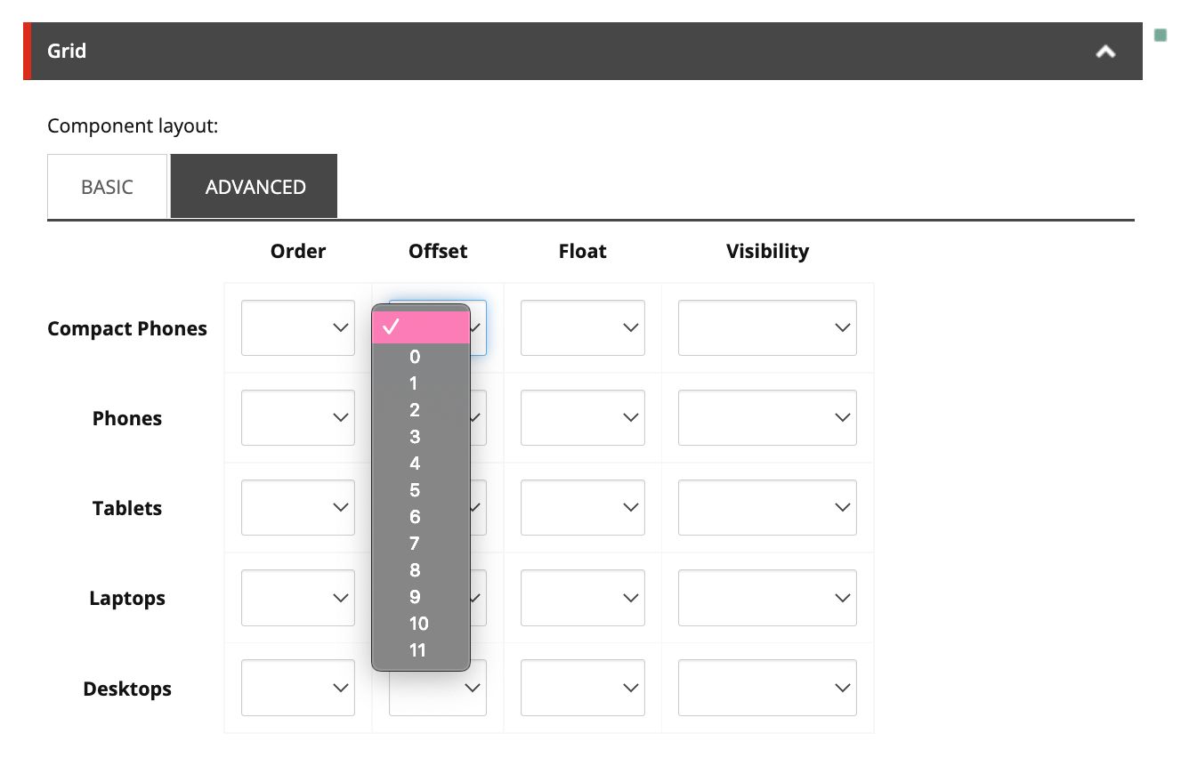
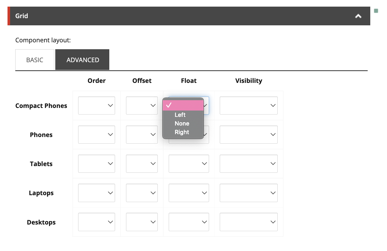
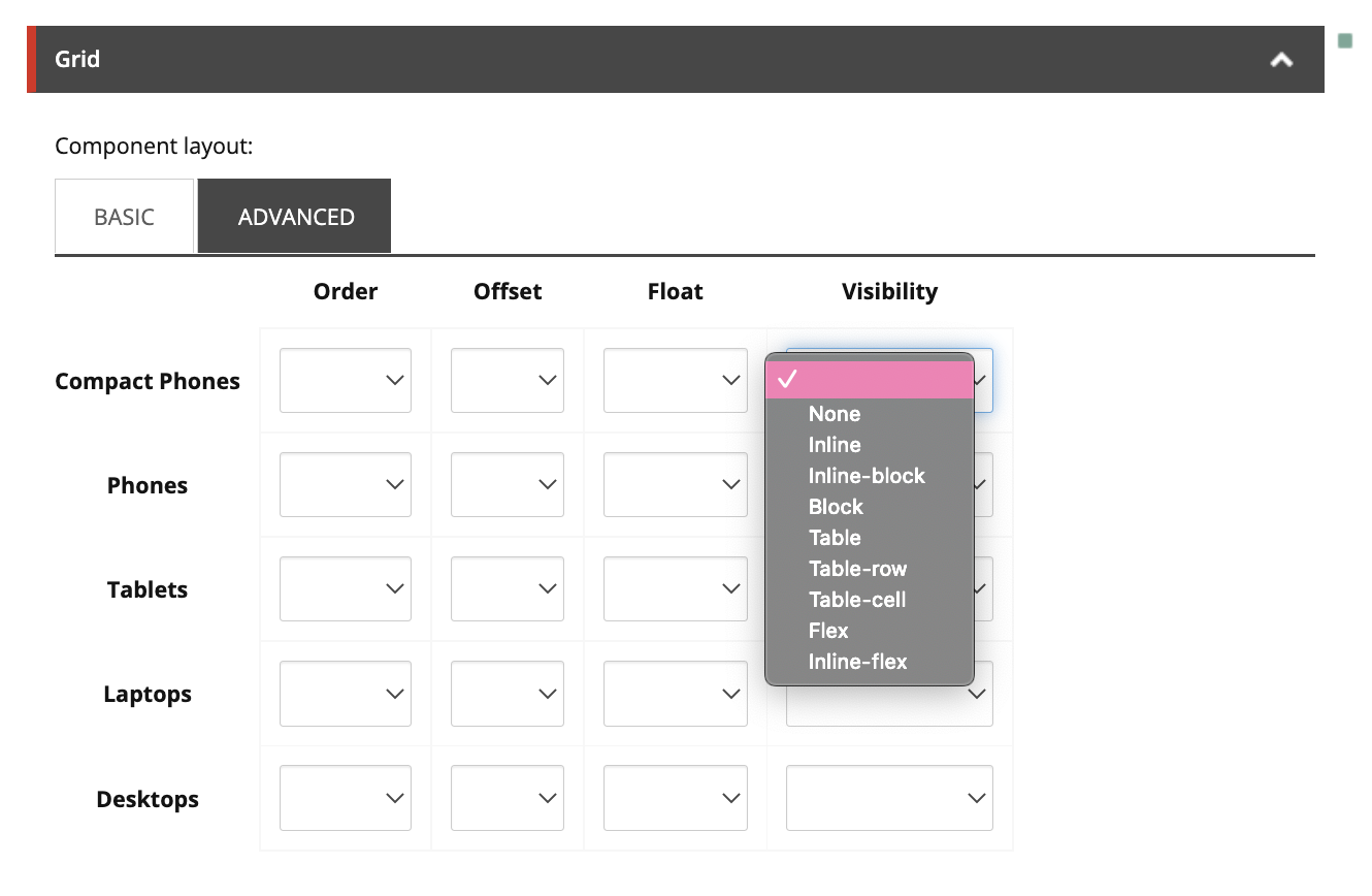
Advanced Layout
The Advanced component layout tab has additional configuration options to further customize the layouts of different renderings. A content author can apply the following layout options to a Bootstrap-configured grid:
Order
Use Order when there are multiple components across a single grid system and the components are to appear in different orders on different devices.
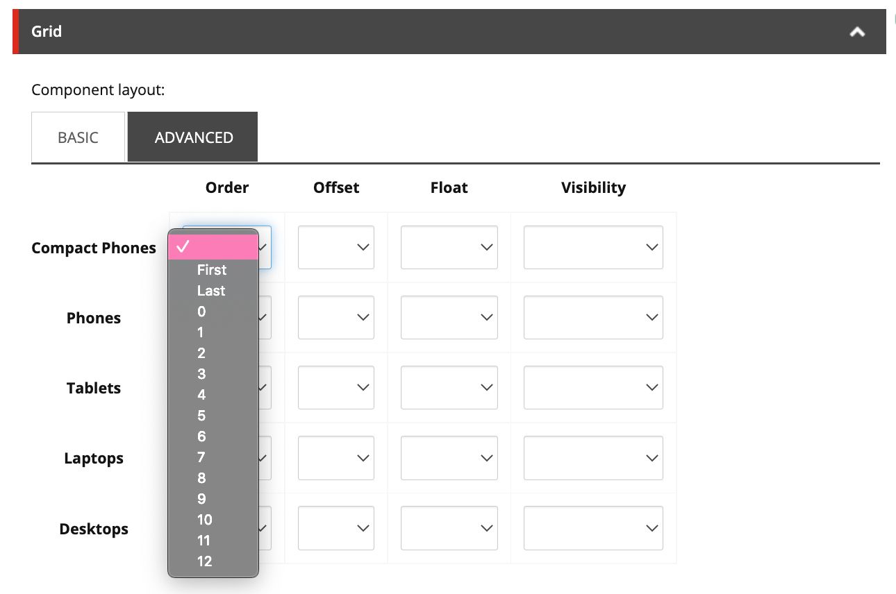
Offset
Use Offset when a component needs to move a number of columns to the right. An example would be if you want to centre a Rich Text component that’s 6 columns wide. In Basic, the width is set to 6. In Advanced, Offset would be set to 3. This put 3 columns on each side of the 6-column width component to total 12 (3 [offset] + 6 [component] + 3 [empty]= 12 columns).
Float
Use Float when a component needs to be on the far left or right side of its grid, allowing text and inline components to wrap around it.
Visibility
Use Visibility to determine when and how that component appears on different devices. For example:
- None - Doesn’t show at all for that device
- Inline - Appears within the row/column of components
- Inline-block - Appears in a new row/column, but shares the row/column with content that follows
- Block - Appears in its own row/column.
- Table - Lets the element behave like an element
Final Thoughts
It’s best practice to change the grid settings of a component over using additional column or row splitter components to change the layout of a page.
This limits the number of components on the page, making your page more responsive, and can improve the speed of the Experience Editor.
Happy Content Authoring!
