Tips For Minimalistic Web Design
5 Elements That Have The Largest Impact
5 Elements That Have The Largest Impact
This blog will cover the top five minimalistic design tips to have the biggest impact on your web design. Let's go over them in more detail.
A minimalist approach to web design aims to reduce the number of items and information in interfaces while still supporting user tasks.
A designer must meticulously select items to build a genuinely minimalist interface, displaying just those that are of the utmost relevance and removing everything that might divert users' attention from what's crucial (such as superfluous decorative elements).
Every element in a design, whether it be an image or some copy, should serve a specific function; it shouldn't be used unless it is absolutely required to communicate the intended message.
Less stuff is required.
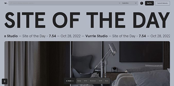
It should be no surprise that the most common element in minimalism is no element at all.
The most crucial aspect of minimalism and what gives it most of its force is negative (or white) space.
Simply put, negative space is the space between visible components.
More empty space means more emphasis on existing elements. In Japanese culture, it’s known as the ma principle: treating the space between objects as a means to emphasize the value of those objects.
While negative space is often called white space, it doesn’t have to be white. Some websites use full-color backgrounds to energize a blank canvas.
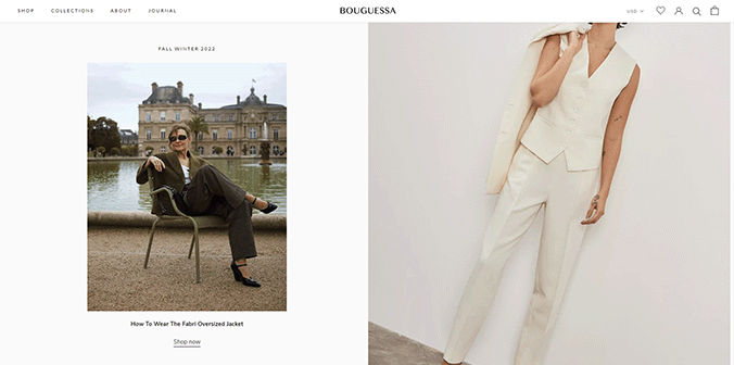
For minimalism, this is accurate. Edit your content so that it only contains the information that is absolutely necessary to convey your point.
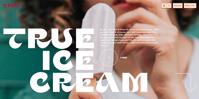
While minimalism and simplicity are distinct concepts, minimalism should be simple.
Being able to do activities quickly and without being distracted is one feature that streamlines the user's experience.
Intuitive navigation is the main contributor to this level of simplicity.
But navigating a minimalist UI is difficult because designers frequently conceal some or all of the navigation in an effort to eliminate superfluous features and simplify the information.
Even with today's minimalist web design and mobile user interfaces, a menu symbol that extends to a complete list of things is still a common design option.
Keep in mind that one of the main objectives of website design is always simple navigation. Make sure users can quickly discover what they need while designing simple websites.
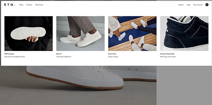
Animation should adhere to the minimalist ideals of being subtle and using only what is necessary, just like any other element.
An effective user interface animation serves a purpose and is meaningful.
You could, for instance, employ animation to save up screen space (revealing hidden details on hover).
An otherwise boring chore is made a little bit more enjoyable by the animation in the example below, which adds a degree of discoverability.

Minimalist websites simplify interfaces by removing unnecessary elements and paring down content that does not support user tasks.
Such websites are inspirational because they combine excellent usability with beautiful design: A attractive, simple-to-navigate website is an effective communication tool.
Enjoy!Start typing to search...