Reading time: 6 min read
Optimize Styling Using Tailwind CSS
Learn how to optimize styling using Tailwind CSS and its configuration file.
Start typing to search...
In order to use the powerhouse that is Tailwind CSS, you must first configure its configuration file. By default, the configuration file tailwind.config.js is optional, and every part of the file is optional as well. By knowing how the parts of the file are used, we can optimize creating reusable styles for development.
module.exports = { content: [], theme: { extend: {}, }, safelist: [], } 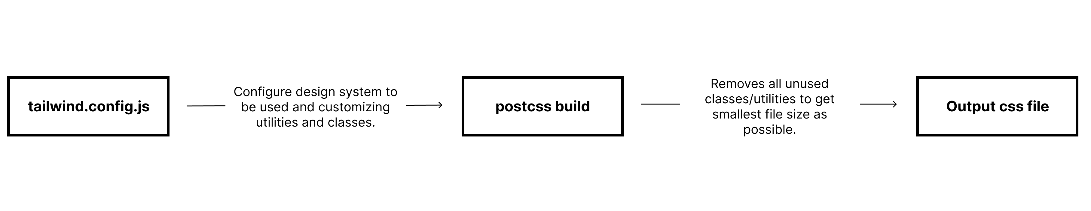
The tailwind.config.js file plays an important role in setting up the design system as well as all possible utilities and classes we can use.
I’ll be talking about the following core parts of tailwind.config.js:
The content section should contain the paths to all of the HTML templates, JS components, and any other files that contain Tailwind class names. Tailwind CSS needs to know all the used Tailwind class names in order for it to generate the CSS for those styles. Any unused classes will not be generated, optimizing file size for the stylesheets.
module.exports = { content: [ './pages/**/*.{html,js}', './components/**/*.{html,js}' ], // ... } Paths are written as glob patterns, making it easy to match all files in your project using wildcard characters. These paths are relative to your project root, not the tailwind.config.js file.
* to match anything except slashes and hidden files** to match zero or more directories{} to match against a list of optionsRules to remember when configuring the content section.
node_modulesFor more information on content configuration please refer to Tailwind CSS Documentation.
The theme section contains anything related to the visual design of your site.
This section includes—but is not limited to—the following options:
You will be able to use classes directly into your HTML files without having to create specific classes or inline styles for specific tags.
The default breakpoints are based on common device resolutions. Configuring the breakpoints will change the min-width in a media query. You will be able to use the keys as prefixes on classes on HTML code.
module.exports = { theme: { screens: { 'sm': '640px', // => @media (min-width: 640px) { ... } 'md': '768px', // => @media (min-width: 768px) { ... } 'lg': '1024px', // => @media (min-width: 1024px) { ... } 'xl': '1280px', // => @media (min-width: 1280px) { ... } '2xl': '1536px', // => @media (min-width: 1536px) { ... } } } } To add a specific style for a certain breakpoint, you will need to prefix the utility with the breakpoint name, followed by the : character:
<img class="w-16 md:w-32 lg:w-48" src="..."> By default, similar to other frameworks, Tailwind uses a mobile-first breakpoint system. This means that utilities with no prefixes will start targeting mobile and up. Overriding larger breakpoints using the prefix.
The example above tells us that w-16 applies right before the md breakpoint, followed by the lg breakpoint.
The colors section contains the global color palette to be used on the project. Multiple shades of the same color can also be configured by grouping them together using the nested color object syntax.
module.exports = { theme: { colors: { transparent: 'transparent', black: '#000', white: '#fff', gray: { 100: '#f7fafc', // ... 900: '#1a202c', }, // ... } } } These can be used as colors for text color utilities, border color utilities, and more.
<p class="text-gray-100 bg-white border-black"></p> The spacing section allows the customization of global spacing and sizing scale on the project.
Examples on how these are set on tailwind.config.js
module.exports = { theme: { spacing: { px: '1px', 0: '0', 0.5: '0.125rem', 1: '0.25rem', 1.5: '0.375rem', 2: '0.5rem', 2.5: '0.625rem', 3: '0.75rem', 3.5: '0.875rem', 4: '1rem', 5: '1.25rem', //…. 80: '20rem', 96: '24rem', }, } } These can then be used on your HTML as classes that affect options such as:
<div class="p-10 w-80 m-10 h-4"></div> More keys can be used under the theme section, which can be found in the Tailwind CSS Core plugins. Here is a list of some of the core plugins:
Tailwind CSS comes with a default theme configuration. There are 5 different ways to customize the default theme depending on your objective, but we’ll focus on three.
module.exports = { theme: { // .. extend: { screens: { '3xl': '1600px', } } } } theme section it will replace the default option. Any keys not added will automatically use the default configurations of those options.module.exports = { theme: { opacity: { '0': '0', '20': '0.2', '40': '0.4', '60': '0.6', '80': '0.8', '100': '1', }, // the default opacity configurations will be overridden extend: { screens: { '3xl': '1600px', } // the screen options will remain and will have an added ‘3xl’ } } // the rest of the theme options will remain } false under the corePlugins configuration rather than to set it under the theme section as an empty object. Both will have the same results but having them all in corePlugins will make tracking easier and consistent.module.exports = { corePlugins: { opacity: false, } } To get the best file size possible we mainly rely on having it in the content configuration, but it depends on how your project is set up. For example, if classes are fed through an endpoint or if certain classes are not be located on your content, you might need to do some customizing on Tailwind.
module.exports = { content: [ './pages/**/*.{html,js}', './components/**/*.{html,js}', ], safelist: [ 'bg-red-500', 'text-3xl', 'lg:text-4xl', { pattern: /bg-(red|green|blue)-(100|200|300|400|500|600|700)/, variants: ['hover', 'focus'], }, ] // ... }